Table of Contents
In this article I’m looking at how to use a system font stack or a web safe font stack. I’ll be using the Bricks Builder, but the principles are the same whether using Gutenberg, a page builder, or coding by hand.
Video Version
The video has the full walk-through. This article has the summary.
Three Types of Fonts
So for the sake of this video I’m dividing fonts into three categories:
System Fonts
System fonts are fonts that are already installed on the user’s machine, on their device, and they are the default fonts on that device. The advantage of a system font stack is the fonts are already installed on the machine. There is no flash of un-styled content if a large font file is being downloaded, so there’s no layout shift or anything like that. Also, system fonts are usually designed for good readability and accessibility. So there are good advantages to system fonts.
Here are the system fonts for a number of systems:
| Platform | Default System Font |
|---|---|
| Windows 10 | Segoe UI |
| Windows 11 | Segoe UI Variable |
| Mac OS (macOS) | San Francisco |
| iPad OS | San Francisco |
| iPhone OS (iOS) | San Francisco |
| Android | Roboto |
| Chrome OS | Google Sans |
| Ubuntu | Ubuntu Sans |
| Red Hat | DejaVu Sans |
| Gnome Desktop | Cantarell |
| KDE Desktop | Noto Sans |
| Fedora | DejaVu Sans |
| SUSE | DejaVu Sans |
| Slackware | DejaVu Sans |
| Debian | DejaVu Sans |
| Mint | Ubuntu Sans |
| Gentoo | DejaVu Sans |
| Arch Linux | DejaVu Sans |
| FreeBSD | DejaVu Sans |
With all those advantages why isn’t everybody using a system font stack? Well the big disadvantage is that you have little control over the look and feel as you don’t control the font that’s being used. Devices have different default fonts installed and likely the system font doesn’t align with you or the client’s brand. Also, along the same lines, system fonts can vary in the size of the font, the amount of space between the letters, and the font weight. The font chosen as default on the device can also vary not only by device, but by language as well. So your webpage might look a lot different depending on the user’s device and language.
Web Safe Fonts
Web safe fonts are also installed on the user device. That’s where the term “web safe” comes from, they are safe to use because you know they are preinstalled. Web safe fonts may or may not also be the default system font. A web safe font stack has the same benefit of a system font stack of being pre-installed, but with a web safe font stack you can set a preference for which fonts are going to be loaded. In other words, you have some control of the fonts used, which gives you more control over the look and feel.
With web safe fonts there are still limits, as not all fonts are available, but as we will see, it is possible to achieve a decent level of consistency across devices.
Web Fonts
The third category are custom web fonts, and that’s what we’re most familiar with, like Google fonts, for example. These days we usually install those on the website, but you could also link to them, though that might have GDPR issues. The big advantage of web fonts is that you have control over the font being used, which is a big plus for branding and that is why it is the preferred choice. On the downside, custom fonts have to be downloaded to the user device.
What Is A Font Stack?
I’ve mentioned several times a “font stack,” but what is that? Well, we are all familiar with individual fonts, like Roboto, Times New Roman, and so on. A font stack is a list of fonts that are defined in CSS as a “font family.” The font-family declaration looks like this:
font-family: Roboto, "Helvetica Neue", sans-serif;The way it works is that the web browser starts on the left and runs through the list of fonts looking for a match on the device. It uses the first match. So in the example above, it starts with Roboto and if that is not found then looks for Helvetica Neue. It is considered a good practice to end the font family declaration with the type of font and if there are no matches in the list then the browser will use the default font of that type.
Note: Elvis Krstulović told me that if the chosen font does not contain all of the glyphs needed to render the content that the browser will use another font to render those characters.
The most common types of font include sans serif, serif, monospace, and script. Here I’m going to focus on “sans serif” fonts as system fonts are usually sans serif.
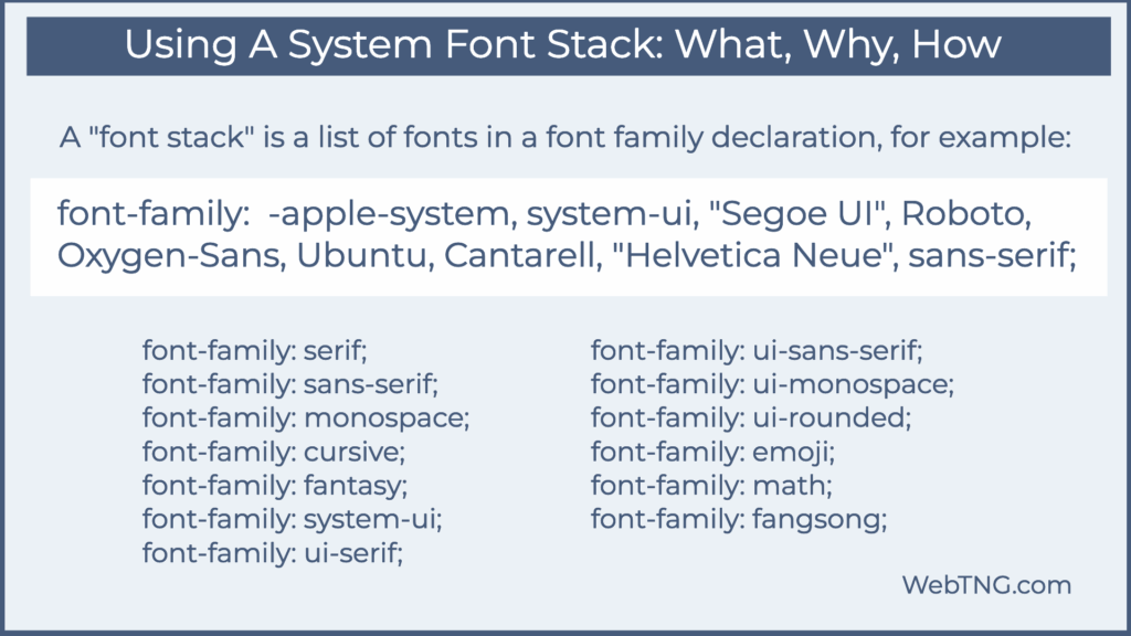
In the image above we see a list of generic font types. These are not actual fonts, but are CSS designations. Of interest to us is the system-ui generic font type.
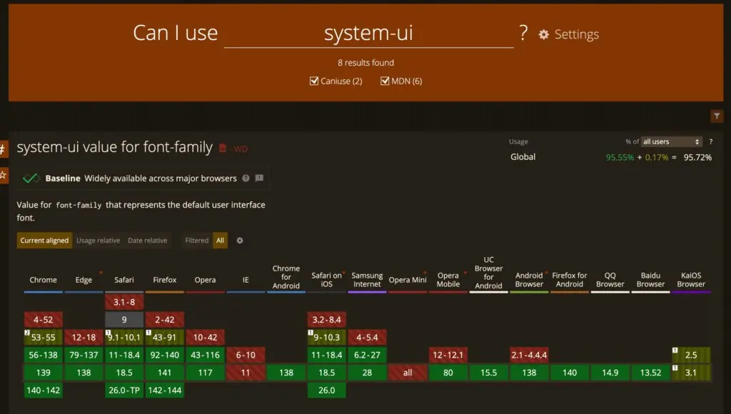
The system-ui generic font designation is now baseline and supported by all modern browsers, but not supported by IE and Opera Mini. Why not just use system-ui and skip the list of fonts? It seems that there are still enough old devices and browsers that it is still best practice to include a complete stack.
Some Sites Using a System Font Stack
In the image below we see the font stacks used for Reddit, Weather.com, Booking.com, PubMed, and the WordPress admin. Weather.com is a bit of an outlier in that IBM Plex Sans is an IBM mainframe system font, and that site doesn’t include the -apple-system and system-ui options. The rest of the sites do include those.
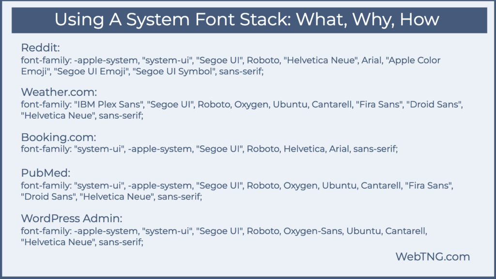
One odd thing I noticed was that the system-ui item was in double quotes on all four of them. What? The MDN docs:
“Generic font families are a fallback mechanism, a means of preserving some of the style sheet author’s intent when none of the specified fonts are available. Generic family names are keywords and must not be quoted. A generic font family should be the last item in the list of font family names.”
The W3C draft of the CSS standard also says the same. Double quotes are allowed, but only if the font by that name is desired.
“Font family names that happen to be the same as a font-family keyword value (e.g. CSS-wide keywords such as inherit, or keywords such as serif) must be quoted to prevent confusion with the keywords of the same names. UAs must not consider these keywords as matching the type.”
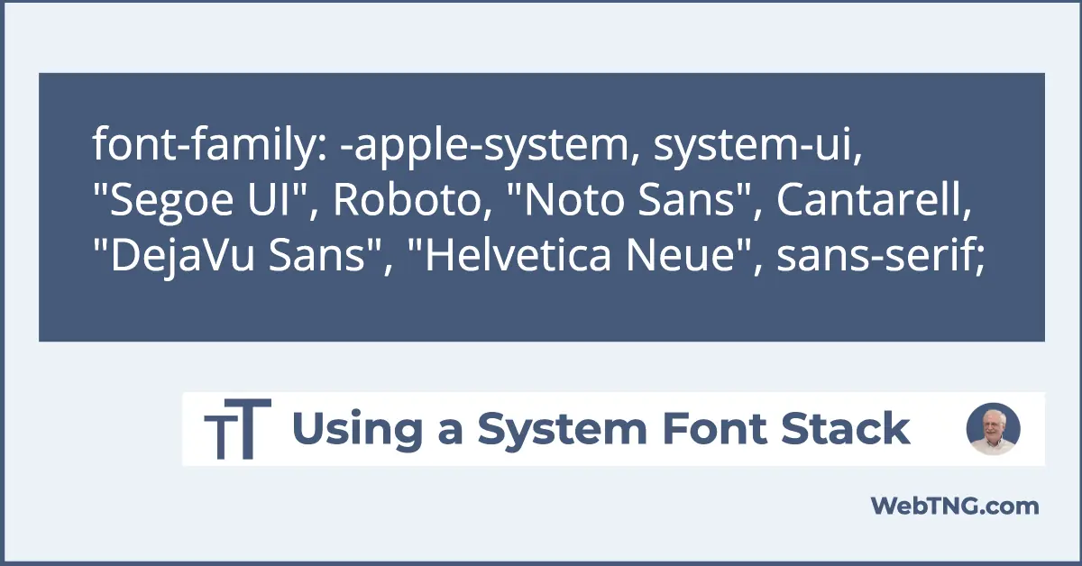
My System Font Stack
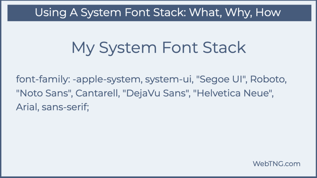
font-family: -apple-system, system-ui, “Segoe UI”, Roboto, “Noto Sans”, Cantarell, “DejaVu Sans”, “Helvetica Neue”, sans-serif;
So this is what I came up with as the “quote unquote “optimal system font stack.” First -apple-system. Now current Apple devices will understand system-ui, but old ones won’t. -apple-system was a designation created by Apple to say use the Apple system font. So that will catch older Apple devices. Then system-ui, not in double quotes, should tell pretty much every modern browser, go ahead and use the system font. Then we have Segoe UI for Windows. We have Roboto for Android. We have Noto Sans for the KDE desktop, Cantarell for the Gnome desktop. We have DejaVu Sans, which I think is the most common font installed on Linux computers. Then Helvetica Neue, which is all over the place on Mac and Windows. Then Arial, which is on every Windows machine since Windows 3.1. And then the generic fallback sans-serif. All right. So that’s my system font stack. You notice I didn’t add the emojis. If you’re using emojis, you might want to add those.
Final Note
I’m curious what your takeaway from this is and what your system font stack would be?