
Table of Contents
Introduction
This is a rewrite of the original article that was published in January of 2020. The information in the original still largely holds, but WordPress core has added new image sizes and WebP and AVIF have become common place. I’ve also expanded the article to add more code snippets for power users.
WordPress creates several copies of each image you add to the Media Library, each of a different size. It is very likely that the default settings that control the size and number of images created do not align with the image sizes your site actually uses, thereby wasting disk space and server resources. Further, if you are using an image optimization plugin like ShortPixel and are paying by the number of rendering images and not by the number of source images, then you may be paying to optimize images your site never displays.
While there are articles scattered around the web about the Media Library defaults, the information tends to be incomplete. Also, there are almost no suggestions for users on how to change the media settings for optimal use so I suspect that many site builders just ignore them. In this post I look at the images WordPress creates by default so that you can understand what is going on. I then draw some conclusions and make some actionable suggestions, which I hope will be useful.
Update April 7, 2026 – It seems that all major social platforms now support WebP and that the potential problem areas are narrower than I thought. Support for WebP might not be complete for third party services like feed readers, note taking apps, and link previews in some apps. Given this updated information I changed my recommendation to go ahead and use WebP for Open Graph purposes.
What Images Are Created – A Typical Case
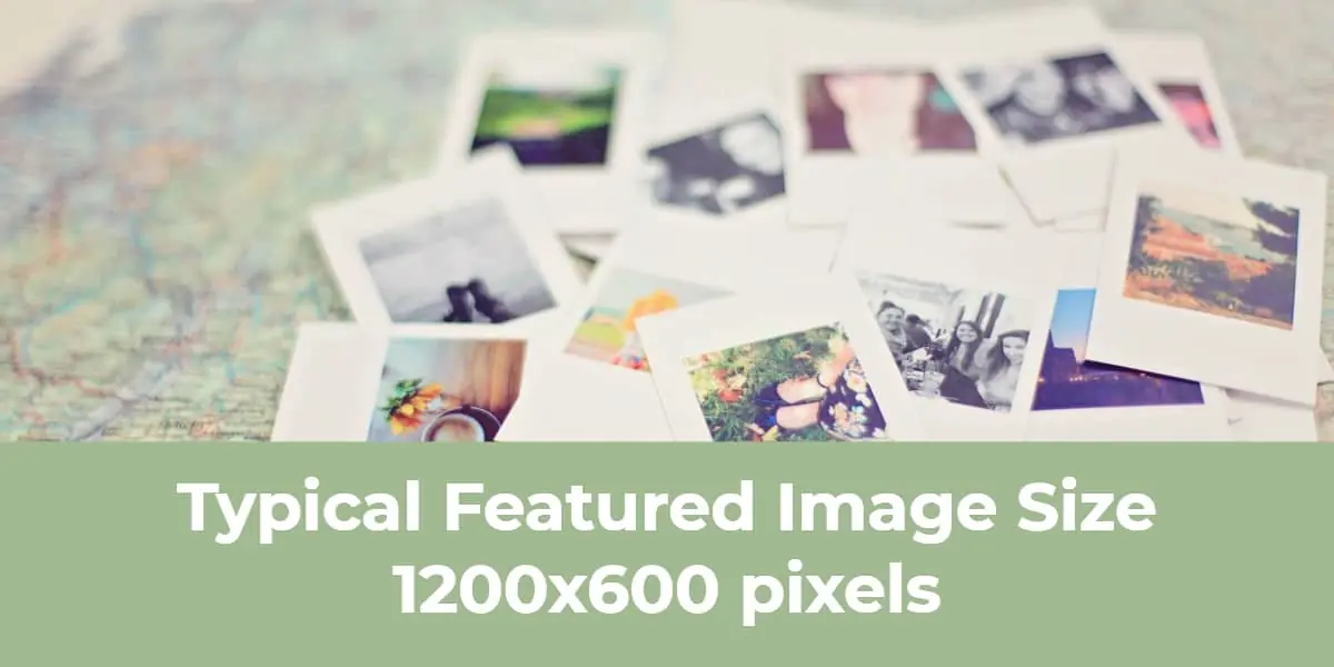
From my unscientific survey it appears that the most common size for a Featured Image is 1200x600px, so we will use that as our example. If you use a different size don’t worry, the conclusions still apply. I’m also assuming that you use other images of various sizes in your post content and we will also consider how those are handled.
Sizes Created According the the Media Settings
By default WordPress has these settings under Admin / Settings / Media:
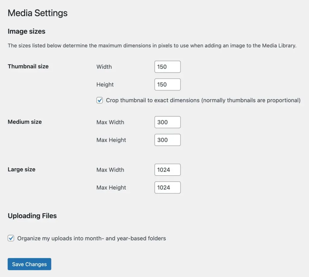
Note that under “Thumbnail size” there is an option to crop the thumbnail to the exact dimensions 150x150px, but under the “Medium size” and “Large size” there is not. The forced cropping is called a “hard crop” and by default WordPress makes the hard crop for the thumbnail like this: the image is first scaled down to 150px based on the smallest dimension and then the other dimension is cropped equally to the center. Here is our Featured Image rendered according to the defaults:

As you can see, that is a worthless image. The other settings, for the Medium size and Large size, are called “soft crops” and they work like this: The longest dimension is scaled down to the max setting and the shorter dimension is scaled proportionally to maintain the aspect ratio.
The medium image is a usable image, but we also have a large image being created that is 1024x512px. When we insert the Featured Image we want to use a 1200x600px as the Featured Image in our posts, so the Large image settings may also something to tweak (discussed below in the recommendations section).
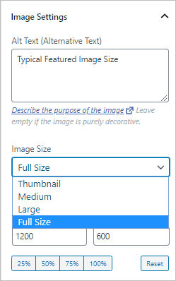
WordPress gives us options when we insert an image from the media library of which size we want to use and we can usually select “Full Size” to get the one we want. However, it is usually best to pick the smallest size that will work so as to keep the overall page size small.
Extra Size Created for Responsive Images Feature
From this we might assume that even though we only see one copy of each image when we look into the Media Library, WordPress is actually storing 4 copies: Thumbail size, Medium size, Large size, and Full Size original. However, in December 2015 WordPress 4.4 “Responsive Image Source Sets” were introduced. This uses a feature supported by most web browsers that adds a list of available image sizes to the image tag so that the browser can pick the best image size, given the user’s screen size. Here is an example of the HTML markup from the Featured Image above:
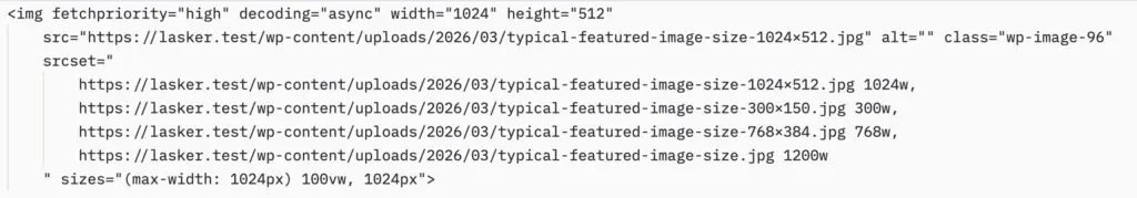
Note that the Thumbnail size isn’t included because it is square and so not the right aspect ratio to match the image in the post. Also note that there is a new size showing, the “Medium Large” image. This is a new size that is created behind the scenes by WordPress to include in the “srcset” tag. There is no default way to use this image directly in your posts, but it is usable by web browsers when the post is being read. I’m not against this new image size being added if it provides a better viewing experience for readers. There is a nice explanation of this feature in Smashing Magazine. The Medium Large size defaults to 768px wide with no height constraint.
Your Theme May Create Additional Images
Your theme can set additional image sizes to accommodate its features. For example, I switched to a popular magazine theme from the WordPress theme directory.

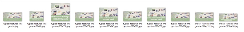
Magazine themes are notorious for creating multiple sized copies to align with the various views of the content they offer. I removed and re-uploaded the image and we can see that 9 copies of the original were created.
WordPress 5.3 Handling Big Images
I imagine at this point you are suffering from information overload, I know I am, but there is another source of image copies. In WordPress 5.3 a new behind the scenes feature was added for handling really big images. Sometimes people upload huge images, maybe from their digital camera or cell phone. These images are much larger than most sites want to actually show, so WordPress now handles these automatically and by default sets the max “Full Size” to 2560px. If an image is uploaded with a dimension greater than 2560px then the longest dimension is set to 2560px and the other dimension is scaled down proportionally. This introduces a new size for big images that has the original image name with a “-scaled” size attribute. For example, “DSC_0018-scaled.jpg.”
When you select a Full Size image in the WordPress editor you now get that scaled image and not your original image. This protects unsuspecting non-tech authors from accidentally adding huge images from their cameras into a post, but it also prevents people, say photographers, from including the original image if that was their intent.
Note: It is important to note that core does not apply big-image scaling to PNG uploads. Scaling large PNGs can actually produce a larger file than the original, so WordPress skips this step for that format entirely. If you upload a 4000 px wide PNG, it will not be scaled down — which can catch people off guard if they expect consistent behavior across image types.
Further, if you happen to upload a big image WordPress will not only create the scaled image, but also some images for high definition screens that are twice the size of the medium and large images. These are High-DPI (Retina) Sub-Sizes that are 1536px wide and 2048px wide.
So if we upload a big image, say for example 4000×2000 pixels, this is what we potentially end up with on disk by default:
- Thumbnail size – 150x150px
- Medium size – longest dimension is 300px
- Medium large size – an image with a dimension that is 768px
- Large size – longest dimension is 1024px
- Medium large size x2 – longest dimension is 1536px
- Large size x2 – longest dimension is 2048px
- Scaled image size – longest dimension is 2560px
- Original image
That gives us at least 8 images, assuming your theme doesn’t add any.
WordPress Adds Native WebP Support
WordPress 5.8 (July 2021) added native support for uploading and serving WebP images. WebP is a modern image format developed by Google that typically produces files around 30% smaller than equivalent JPGs, with no perceptible quality difference at comparable settings. All modern browsers support WebP.
WordPress Adds AVIF Support
In February 2024 WordPress 6.5 added support for the AVIF image format, so you can directly upload AVIF files. AVIF images can be up to 50% smaller than JPEGs while maintaining the same image quality. They also support a wide range of colors (including HDR) and produce sharper images than JPGs. AVIF images are also widely supported by web browsers, but not as fully as WebP images.
But Wait! There Is More – Automatic HEIC-to-JPEG Conversion
WordPress 6.7 (November 2024) added automatic server-side conversion of HEIC images to JPEG on upload. HEIC is the default photo format on iPhone and iPad (and is increasingly common on some Android devices and Canon cameras), but browser support for HEIC remains limited.
Before 6.7, uploading a HEIC file to WordPress would fail silently or produce an unusable result for most users. Now, if your server’s Imagick library supports HEIC (you can check under Tools → Site Health → Info → Media Handling → ImageMagick for supported file formats), WordPress automatically converts the file to JPG, generates all the usual sub-sizes from that JPG, and makes the original HEIC available as a separate download on the attachment page.
This is a feature for non-technical authors uploading directly from iPhones. However, be aware that HEIC-to-JPEG conversion can produce large files, sometimes nearly double the size of the HEIC original, before WordPress even begins generating sub-sizes. This amplifies the file proliferation problem the rest of this article addresses. If you have control over the upload workflow, encouraging authors to resize or avoid uploading HEIC images is a good approach.
By the way, you can disable the automatic HEIC conversion with a PHP filter:
// Disable automatic HEIC to JPEG conversion (WordPress 6.7+)
add_filter( 'image_editor_output_format', function( $output_format ) {
    unset( $output_format['image/heic'] );
    return $output_format;
} );
Performance Plugins and WebP or AVIF
This means that you can now upload JPG, PNG, WebP, and AVIF images directly to the Media Library. WordPress will generate all the usual sub-sizes in the formats you specify using code snippets, provided your server’s image processing library (Imagick or GD) supports the chosen format. You can check this under Tools → Site Health → Info → Media Handling. Before you switch 100% to WebP or AVIF images, read more on this below in the recommendations section.
There is often a disconnect between image apps used to create images and the new WebP and AVIF formats. The image editor apps allow you to save as JPG or PNG, but not WebP or AVIF! This means that people often upload in the old format and have a conversion process for their site.
Because smaller image sizes mean that your pages load faster, it is now common for sites to have a performance plugin which creates WebP or AVIF versions of your images. This sometimes means that in addition to the JPG image sizes mentioned above, you also end up with WebP / AVIF images. This is good for fast loading pages, but not for conserving disk space. One way of handling this is that some optimization plugin keep the new sized images on a Content Delivery Network (CDN) so the size of your media library doesn’t get too big.
Image Related PHP Code Snippets
Feel free to skip this section or come back to it later if needed. It is included here more as a reference.
You can inspect what sizes are currently registered on your site with this snippet in a test page:
// List all registered image sizes with their dimensions
// wp_get_registered_image_subsizes() was introduced in WordPress 5.3
$all_sizes = wp_get_registered_image_subsizes();
foreach ( $all_sizes as $name => $data ) {
    echo esc_html( $name ) . ': '
        . esc_html( $data['width'] ) . ' × '
        . esc_html( $data['height'] )
        . ( $data['crop'] ? ' (hard crop)' : ' (soft crop)' )
        . '<br>';
}
You can register custom image sizes using this function (examples below). Note that it accepts an options $crop parameter that specifies soft crop ‘false’ (the default), ‘true’ for hard crop centered, or an array such as “array(‘left’, ‘top’)” to specify corners or edges.
add_action( 'after_setup_theme', 'my_image_sizes' );
function my_image_sizes() {
    // Soft crop — scales proportionally, no cropping
    add_image_size( 'seo-image', 1200, 630 );

    // Hard crop — center-crops to exact dimensions
    add_image_size( 'archive-image', 600, 400, true );

    // Hard crop with a specific anchor point (left, top)
    add_image_size( 'sidebar-image', 300, 200, array( 'left', 'top' ) );
}
You can use remove_image_size() for custom (non-reserved) size names. Note that this only prevents new copies from being generated, existing files on disk are not deleted automatically.
add_action( 'init', 'my_remove_unwanted_sizes' );
function my_remove_unwanted_sizes() {
    remove_image_size( 'first-plugin-size' );
    remove_image_size( 'second-theme-size' );
}
You can disable built-in image sizes. The reserved names (thumbnail, medium, medium_large, large) cannot be passed to remove_image_size(). To prevent WordPress from generating them, set their dimensions to zero — either in the admin under Settings → Media, or via code. Because each update_option() call writes to the database, do this in a one-time hook rather than on every page load:
// Run once on theme activation — sets medium_large dimensions to 0,
// which tells WordPress to skip generating that size.
add_action( 'after_switch_theme', 'my_disable_unused_default_sizes' );
function my_disable_unused_default_sizes() {
    update_option( 'medium_large_size_w', 0 );
    update_option( 'medium_large_size_h', 0 );
}
Or, you can use the intermediate_image_sizes_advanced filter to remove sizes at generation time without touching the database at all. I would probably keep the “medium_large” size.
add_filter( 'intermediate_image_sizes_advanced', 'my_filter_generated_sizes', 10, 3 );
function my_filter_generated_sizes( $new_sizes, $image_meta, $attachment_id ) {
    // Remove medium_large and the 5.3 high-DPI sizes from generation
    unset( $new_sizes['medium_large'] );
    unset( $new_sizes['1536x1536'] );
    unset( $new_sizes['2048x2048'] );
    return $new_sizes;
}
It is always a good idea to avoid uploading big images. If you can keep images at 2560px or smaller then you don’t have to think about the big image handling that was added in WordPress 5.3, which is triggered at 2560px. If you do need to use big images then you can either live with the extra images created or you can add a PHP snippet added to your child theme’s functions.php (use a code snippets plugin, or create your own functionality plugin) to turn that feature off.
add_filter('big_image_size_threshold', '__return_false');By default custom sizes only appear in the srcset and they are not listed in the block editor’s “Image Size” dropdown. You can add them so they show in Gutenberg with the image_size_names_choose filter:
add_filter( 'image_size_names_choose', 'my_add_custom_sizes_to_editor' );
function my_add_custom_sizes_to_editor( $sizes ) {
    return array_merge( $sizes, array(
        'hero-image'   => __( 'SEO Image (1200×630)' ),
        'archive-card' => __( 'Archive Image (600×400)' ),
    ) );
}
Other Considerations
If you find that you need to change your image sizes because you left the settings at the default and they don’t apply and / or you want to remove old generated sizes then the Regenerate Thumbnails Advanced plugin is an option. It not only lets you generate new images if you change the sizes in the Media settings, but there is also the option to remove the old unused image copies.
If you are comfortable using the command line, the WP-CLI command “wp media regenerate” is faster for large libraries and can be scoped with “–only-missing” to skip already-generated sizes. Of course, always test on a staging site and take a backup before running a bulk regeneration.
Suggestions and Conclusions
I suspect that many (most?) site builders ignore the Media settings. When writing posts we are able to find an image that works and so haven’t bothered much with what’s happening behind the scenes. However, now that WordPress is creating so many additional copies it is worth taking the time to set some reasonable defaults. The sad news, if you search the Internet, there is virtually no guidance on what to use!
Suggested Featured Image Size
It seems that most general purpose themes, such as Kadence, Astra, Generate Press, OceanWP, or Neve do not define or set a Featured Image size. It is up to you. So I’m going to go out on a limb and make some suggestions.
Of course, if your site is already going strong and you have a Featured Image size that has been used then you should stick with that. Also, if your theme has a recommended size or you have special needs, then use those settings. Otherwise, I’m going to recommend that you go with a Featured Image that is 1200x630px. Why? 1200x630px is very close to the typical Featured Image size, so it is not a big change, but also importantly, it works for several social media sites.
Facebook’s developer documentation no longer specifies a single recommended size, but it now asks for images at least 1080px wide for best display on high-resolution devices, with 600px as the minimum for link ads. The 1200×630px size meets those requirements. X (formerly Twitter) recommends a 2:1 aspect ratio for the large Summary Card format. At 1200×630, the ratio is approximately 1.9:1, which X accepts in practice. LinkedIn and Bluesky recommend 1200x627px for link images. Threads recommends 1200x600px. So, this image is the one I’m suggesting you use for your Featured Image, and also with your SEO plugin for the Open Graph settings. The idea is that if we can use 1200x630px in all these instances then we can avoid creating extra image sizes.
Media Settings
First, make sure the sizes in the Setting / Media page match what you are actually using. Note that if you enter a 0 for both the height and width then that disables that image size. If you enter a value for the width but a 0 for the height then the width will be constrained to the value to enter and the height will be proportional to retain the aspect ratio. For example, going with my suggestion above (of course, if your Featured Image is another size then use the dimensions for that size below),
- Large size: If your Featured Image is 1200x630px then set the Large size to 1200 width and 0 height. Make sure to upload your Featured Image that is the exact 1200x630px size – 1200px wide. If you do, WordPress won’t create a Large size copy, since that size already exists. You can still upload and use images larger than 630px in height to use as you need.
- Thumbnail size: If disk space is tight this the one I think you can disable by entering zeros in both boxes. Otherwise, check your theme. Say for example you are using a grid or masonry style layout with a sidebar, look to see on the page what size Featured Image is actually shown in the blog/archive. Also, unless you are actually using a square image in your theme then I’d un-check the hard crop option.
- Medium size: Remember, WordPress is going to set a Medium Large at 768px wide and your Featured Image is 1200px wide. So, I’d set the Medium size somewhere as one step down from the Medium Large. It will get used in the responsive srcset set of images offered behind the scenes to the browser. I’m going to go with 480 width and 0 height.
I’m focusing the settings on the Featured Image as I imagine that is the size of image that is uploaded most consistently over time.
WebP vs AVIF and Open Graph Images
Both WebP and AVIF are widely supported by web browsers, but Internet platform don’t support AVIF as extensively. For example, the image editing app GetStencil allows for WebP uploads, but not AVIF. Also, while AVIF can generate smaller image sizes, it takes more server resources to generate or convert. At this point I’m planning to go with WebP.
Open Graph data is used for SEO and for social media shares. Today all major social platforms support WebP (but again not AVIF). So I am going to go with WebP for OG images also. I could be skating out on the edge here though.
Note, that a number of third party apps and services may not support WebP yet. For example, note taking apps, web crawlers, and apps that provide a link preview may still be expecting JPG or PNG. So there could be some wisdom in uploading the original Featured Image as a JPG and then have WordPress generate WebP or AVIF versions for all of the smaller sizes. Not surprising, WordPress has a filter for this! The image_editor_output_format filter, which maps source MIME types to output MIME types. Here is an example for WebP:
// Generate WebP sub-sizes when JPGs are uploaded
add_filter( 'image_editor_output_format', 'my_jpeg_to_webp' );
function my_jpeg_to_webp( $mappings ) {
    $mappings['image/jpeg'] = 'image/webp';
    return $mappings;
}
Final Thoughts
Whatever your image size settings, you can still upload images of other sizes if you need to use them in your posts, so you aren’t stuck with the defined sizes. Also, note that if the images you upload are smaller than one of the defined sizes that WordPress will not generate the larger sizes. So, by tweaking the settings you are not giving up any flexibility.
Finally, my suggestions in regards to WordPress image size settings, images created, and options is not the last word. It is my working hypothesis that I plan to implement as I create new sites or update existing sites. As I mentioned, there is not any guidance on this topic, so I hope that we can share our experiences and what we learn in order to use WordPress more effectively. Do you know of something I’ve overlooked or do you know a better way to go about it? Do you have some logic and settings you use? If so, please leave a comment below with your suggestions.


Hello David,
Thanks for the nice overview about image sizes in wordpress. I haven’t found a such comprehensive text so far. You tell in detail under which circumstances, which sizes of image copies are created within wordpress. Nice!
From my sites I found that plugins also create additional images e.g. the plugins menu image and advanced wordpress backgrounds. That makes the situation even more complicated.
I want to add, which image sizes I have chosen so far. From beginning I have chosen a featured image size of 1400px longest side, because my predecessor of a website which I took care after him did chose this default and I kept it. So in backend/settings/media this is the value I enter as large size max width and max height. (Or I enter 0 in both fields, as I upload every large picture converted to either 1400px width or 1400p height using the image magick convert software.) As medium max width and max height I stayed with the default values 300px. And for the thumbnail size I am unsure, I used a value of 0 a long time and did not experience any harm. Probably I did not use thumbnails very often, and if I used them e.g. in my navbar, then a plugin created them independently (menu image).
I was wondering about your large choice of the 450 width and 450 height thumbnail sizes. Is this necessary? Maybe for a blogging site it’s a good choice. Influence by this also your medium max sizes are quite large, 600px. In my opinion this is not optimum, because the new medium large size, automatically created by worpress has almost the same size of 768px.
Just some thoughts
thanks again for your good article
Felibunda
Thank you for the sharing your thoughts and details. I could probably disable the thumbnail size. On another site I’m using square images and could go with a larger square thumbnail. I’ve been looking at the default sizes for social media images and something around 1200 by 670 would work for both Twitter and Facebook. It is a large featured image but for some sites might work … then I wouldn’t need to create those separately.
Hi, sorry this will be a long comment (in bad english), because I am so happy I found this article!!! Finally I feel the mystery of handling images in a modern way with responsiveness and media settings contra layout size on different devices is clearer!!!
I have searched for a guide like this for years, not kidding! And during that time things have changed, with the introduction on responsive images into WP core, srcset. And the new way extra big images is handled. So it´s been super confusing reading older articles (still high up when googling) that talk about how to make sites and images responsive using plugins or code…
Now I understand I can stop thinking about that completely, WP takes care of the problem! Sigh of relief!!
To bad some years ago I read a lot of articles about the benefit of setting all media settings but one to zero, to save server space for sites with a lot of images… Now I have to regenerate them again to benefit from the great srcset responsive function!
I also very much like your thoughts about media size settings, since it is hard to find any tips on whether to change them or not, and if so, into what. Most people seems to leave it as default? Wise or not… I will make a tweak on your suggestions!
My only concern is why we should pay so much attention into Facebook. Doesn´t they change their media settings now and then, so we have to regenerate our images again? I don´t like the idea Facebook has that big power over the layout of my site. (And maybe FB is fading in popularity…?) But of course, that is up to me to follow or not.
More important must be to follow the breakpoints of mobile, ipads and so on? But that is very tricky since there are so many different breakpoints… Do you think it is “impossible” to account for that as well? If I set my featured image/large size to 1200 px, do you know what image size will be used on a really high res mobile?? Large, medium, full?
Or are the size settings you choosed also well adapted to most tablets and mobiles?
I guess WP default image sizes are there to match different devices, but at the same time they´ve had the same pixel width for a long time now and especially mobiles get higher and higher resolutions… Do you think WP will update their default sizes to match bigger screens/higher res?
Thanks, you made me happy!
Thank you for the nice feedback. I agree with you that the media library settings seem to be badly out of date. These days I think most themes define their own sizes and then ignore the settings in the media library. It is a mess.
A number of visitors to my site are from Facebook and YouTube, so I was paying attention to images for the Open Graph data.
I think that the Responsive Image Source Sets (srcset) is meant to provide images for a variety of screen sizes and let the browser pick the best one.
There are lots of tickets in WordPress Trac about the media library. It does not seem to be a priority to the core developers at this time, so I don’t expect to see the issue addressed anytime soon.
Best regards,
David
Hi David, agree with the other posters. This is the best rundown I’ve seen so far. So many blogs neglect to explain all the different image sizes, where they come from and how they are used. It’s crazy given how “expensive” poor image optimization is to your overall site speed.
I had some comments and questions.
– You say “That gives us at least 9 images, assuming your theme doesn’t add any.”
As I was reading I was writing down sizes, and I got 8. Also your bulleted list above this statement also has 8 (including the original image) so did you mean 8?
– Do you have a rough idea of how you would go about cleaning up all the image sizes when you switch to a new theme? I had a theme that had 800 as a “large size”. If I change that and regen thumbnails, it doesn’t seem to change the content in the post that is pointing at filename_571x800.jpg so the posts are broken.
I know I could just leave the old images but I’m switching to better image compression, so I’d really like the posts to point to freshly compressed images. Have you found a way to fix content in the post to match the new sizes that regen thumbnails (or the wp cli version) creates?
Thanks!
Hi Shimona,
Yes, that should be 8. Thanks, I fixed it.
I used Regenerate Thumbnails. I saw in the support thread for the Regenerate Thumbnails plugin that the option to update posts to use the new sizes was missing from the latest version. No idea if that was intentional or not. You might try this one on a test site:
https://wordpress.org/plugins/regenerate-thumbnails-advanced/
I think that ShortPixel (and maybe others) will optimize existing images so that old posts will serve the newly optimized ones.
Best,
David
Yeah the problem is I used smush before and I don’t like the quality of the resulting images. Now that I’m ready to pay for an optimizing CDN I want to start with better quality and avoid double compression. But my existing images are all compressed with smush already.
The free version of Smush does not optimize the original image and the Pro version of Smush makes a backup of the original image before optimizing it. So, you may be able to still use the original ones. I’d definitely try the process on a testing site first!
One of the most useful code snippets I ever acquired will automatically convert any file uploaded to the WP Media Library into WebP. If nothing else, it ensures that any massive files uploaded by naive users will at least be compressed somewhat. Imran Siddiq of Web Squadron has a YT video on the code snippet at https://youtu.be/bYz6lDy7Sok
To get an even better experience, the ASE Admin and Site Enhancements plugin has an Image Upload Control option that not only converts uploads to a specified quality number of WebP, but also downsizes them to sizes you control. I believe you require the premium version of ASE to do this, but that plugin has dozens of other functions that make it a total bargain.