
Table of Contents
Introduction
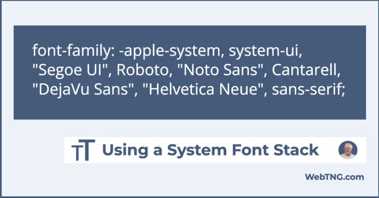
Like it or not, people judge Gutenberg based on their experience using Elementor, Beaver Builder, Divi and other page builders. Its true. We have gotten used to a rich and flexible editing experience, with lots of layout and design choices, and with a module or widget for everything. Consequently, the default Gutenberg experience can feel pretty bare and the core blocks only provide basic functionality. To take Gutenberg to the next level we need to use one of the advanced Gutenberg addons.
In this post I want to look at Kadence Blocks. Kadence is one of the best Gutenberg addons available. With Kadence Blocks you can create more sophisticated and engaging layouts and designs than you can with core Gutenberg. What follows is an overview of what Kadence Blocks offers and a tutorial showing how to take advantage of the Kadence Row Layout block. The Row Layout block is a powerful and flexible container, the cornerstone of the Kadence offering, but it has a lot of options and that can be intimidating. So let’s explore and experiment with it and then we will be ready to use it in our projects.
Video Version
Kadence Blocks – Free and Pro Versions
Free Version
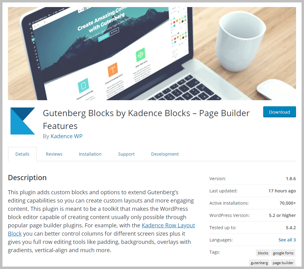
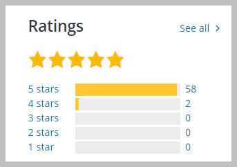
The free version of Kadence Blocks is available in the WordPress plugin directory. It was launched around September 2018, is used on more than 70,000 sites, and has 60 reviews.
The free version currently includes 12 blocks. Some of these, like the Advanced Buttons, Advanced Headings, and the Row/Layout block, are enhanced versions of the blocks included with Gutenberg core. Other blocks such as the Accordion, Form, and the Tabs block, provide features missing from WordPress core.
Pro Version
The Pro version of Kandence Blocks is available from the Kadence WP website. You can purchase an annual subscription stand-alone or an annual membership subscription that includes all of the Kadence themes and plugins. There is also a lifetime membership option which is a one-time purchase which also includes all of the themes and plugins.
The Kadence theme is the newest theme, but there are three others: the Ascend, Pinnacle, and Virtue themes. The other themes are very attractive, but older and don’t have the deep Gutenberg support. The new Kadence theme is a general purpose theme with a ton of Customizer options.
Kadence WP has 17 plugins. Some of them are free and some of them are older, but in addition to Kadence Blocks, there are a few that add features for WooCommerce sites, along with plugins that add gallery, slider, related content and other features. These other plugins may be a good fit for your needs, but I’d say that the Kadence Blocks and the WooCommerce plugins are the main attractions.
Included Blocks and Extensions
I’ve listed the Blocks and Extensions that are included in both versions. As you can see, some of the features of the pro version are that it adds “extras” to the free blocks. Also, the pro version has On Scroll Animation, which isn’t a block itself, but is an extension to other blocks. We will discuss all of these later in the post.
Kadence Free
Kadence Blocks Free
| Block Name | Core Block |
|---|---|
| Accordion | |
| Advanced Buttons | Buttons |
| Advanced Gallery | Gallery |
| Advanced Heading | Heading |
| Form | |
| Icon | |
| Icon List | |
| Info Box | |
| Row Layout | Columns |
| Spacer / Divider | Spacer |
| Tabs | |
| Testimonials |
Kadence Pro
Kadence Blocks Pro
| Block Name | Core Block |
|---|---|
| Advanced Slider | |
| Form Extras | |
| Gallery Extras | |
| Image Overlay | Cover |
| Modal | |
| On Scroll Animation | |
| Portfolio Grid / Carousel | |
| Product Carousel | |
| Split Content | |
| Video Popup | Video |
Theme Support and Integration with Gutenberg
Some people wonder if themes will still be needed in the Age of Gutenberg? I think they will still be important, maybe more-so as we make the transition from page builders to the block editor. There can certainly be advantages from using a theme that has deep support for Gutenberg, but there can also be advantages, as we will see, with block plugins that have integrations with the theme. Such is the case with the Kadence Blocks and the new Kadence Theme.
Astra Example
To show you what I mean, let’s look at Astra for an example. I’m using Astra because it is one of the best in supporting Gutenberg. Style settings made in the Customizer are rendered on Gutenberg content. Here are the color settings in the Customizer and you can see the color styles are rendered on the page.

Here are the button options in the Gutenberg editor. Notice that the color settings from the Customizer don’t carry over as color options in Gutenberg.
Kadence Example
Now, here are the color settings in the Customizer when using the Kadence theme. Note that just like Astra, the color styles are rendered on the page.

Now, here is the difference. Let’s look at the color options for the button block in the Gutenberg editor. The colors from the Customizer have been carried over.
Of course, you can use the Kadence Blocks with any theme, but this theme to Gutenberg integration adds some nice synergy that makes it easier for the content author.
Kadence Blocks Have Setting for Defaults
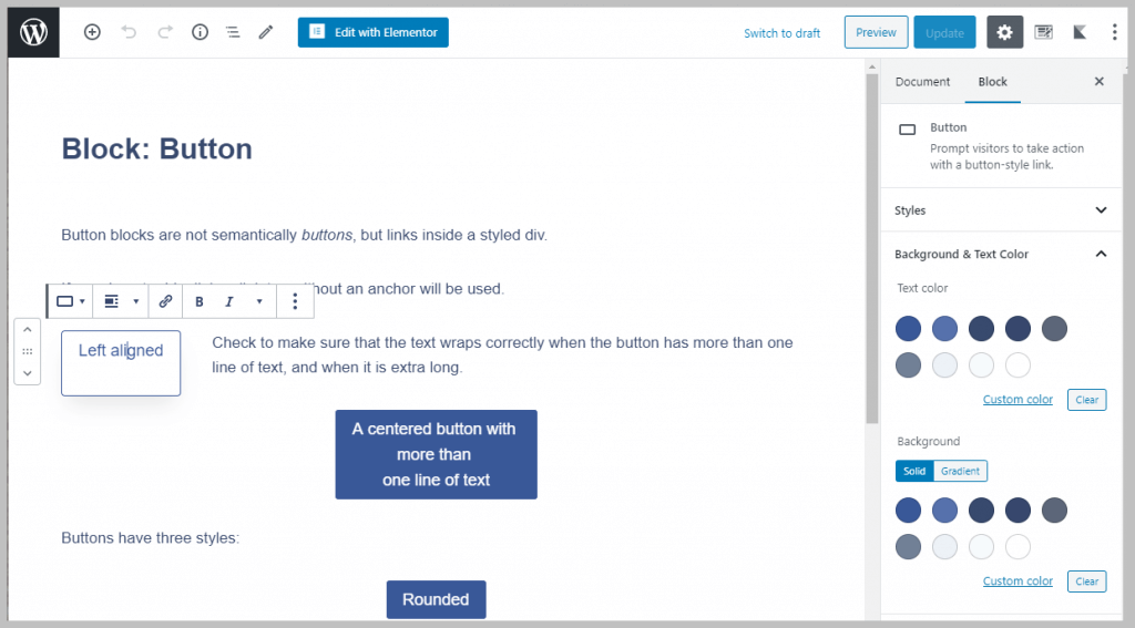
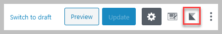
When you are using Kadence Blocks, a settings icon is added to the top right of the Gutenberg editor.
That stylized “K” opens a settings panel where you can set the Kadence Blocks defaults. The top panel is for the color palette and we see the Customizer picks are shown. These theme defaults are locked and cannot be changed, but you can add new colors to the palette.
When you are using the Kadence theme then those locked colors are linked to the Customizer settings. If you can a color in the Customizer then the linked colors are automatically changed as well. This makes it easy to adjust color options as you won’t need to go to each page to correct the colors.
Below the color panel there is a section for the Kadence blocks. Each block has its own panel.

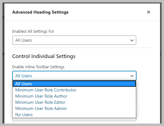
If you click the “eye” icon next to a block item in the list then you get a popup where you can set some access control settings. This is useful if you have multiple authors or you don’t what an author to override the brand styles.
When you click one of the drop downs then you see the role options you can set.
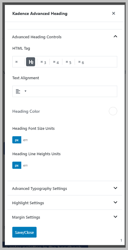
When you click on one of the block items then you get a popup where you can set the defaults for that block. You can still override those when using them in Gutenberg, but this is a really nice feature that can save you time.
You could spend a lot of time going through each block and setting its defaults. I would suggest instead for most people on a single author site that it would make sense to use the blocks first and then when you find that you are repeating yourself by applying the same settings then go and set a default. That way you will understand the settings and the effect they will have.
The Row Layout Block
The core block that is most similar to the Kadence Row Layout block is the Columns Block. The core Columns Block is a container because it gives you a variable number of columns and within each column you can add more blocks.
Something to get used to when using Gutenberg containers is that it is sometimes hard to click up the block hierarchy within the container. What I mean is that if you are in a column and what to do something on the higher container level, it is hard to get to those settings just by clicking. The trick to doing that is to click on the “steps” icon, which is a blocks hierarchy navigator.

Note the block options available with this core block (shown in the screenshot above). You can adjust the number of columns, as well as the text and background colors. The individual columns don’t have any settings of their own.
Now let’s look at the Kadence Row Layout block, which sits at the core of the Kadence Blocks. This is a container block, like the core columns block, but it is very powerful. Think of it like the Elementor Section element. Like the Elementor Section, it hold the rows and columns. The benefit of a container is that it gives you a lot more flexibility for background, margin and padding options, however, the core version is currently oblivious to that opportunity.
Settings on the Row Layout Level
Here I have selected the Row Layout block, just as I had previously for the core column block. The number of differences is astounding.
- On the top settings bar, under the alignment button, you have the option to set the row to wide width or full width.
- Also on the top bar there is an image icon where you can set a background for the row.
- You can set the row content to align to the top, middle, or bottom also from the top bar.
- You have those drag handles on the columns when you use a two column layout and they show the row percentage. That’s easy. You can change the width of the core columns, but not until after you add blocks into them.
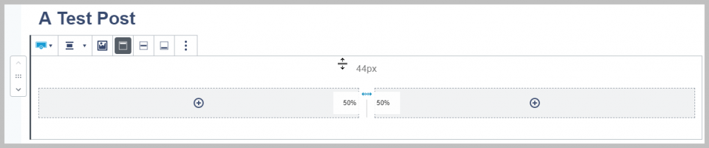
- You can adjust the top and bottom row padding by clicking into the row’s top or bottom and drag resize.
- Looking to the settings panels on the right, at the top we have the ability to adjust settings by device size.
- You can also adjust the gutter size and the layout. Layout options include stacking.
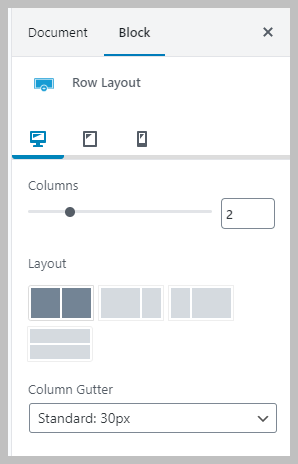
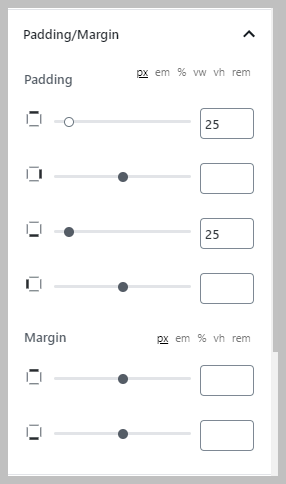
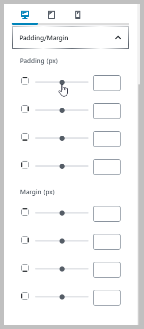
- You have padding and margin options. Note that you can use pixel, em, percent, view port width, view port height, and rem units.
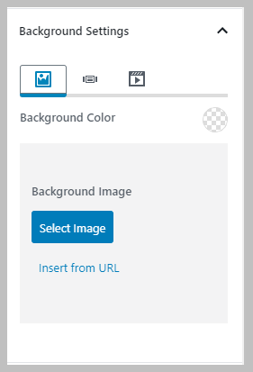
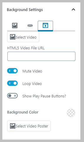
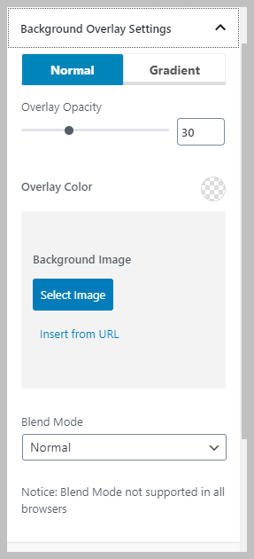
- There are three background options for the row: traditional image and color options, a background slider option, and a background video option

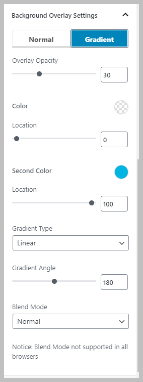
- You have two background overlay sets of options, normal or gradient.
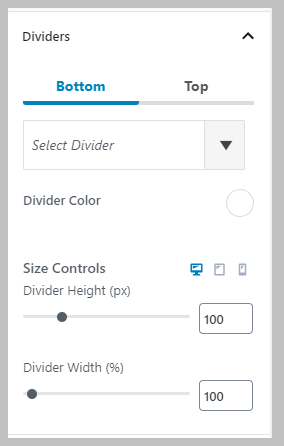
- Then there are row dividers! You have 19 different divider styles that you can choose from to add to the top and / or bottom of the row. Note that you can control these by device size.
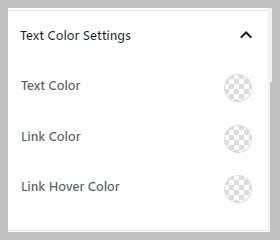
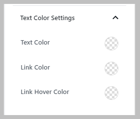
- You have color settings for text, links, and link hover.
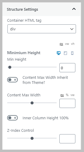
- You have some “structure” settings that let you choose the HTML tag, the minimum height, max width for the content, and a z-index setting.
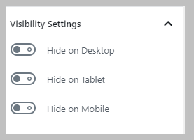
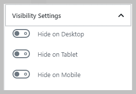
- You have row visibility settings so you can toggle to hide on different device sizes.
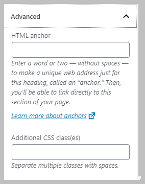
- Finally, you have advanced settings, which is not only allows you to add CSS classes, but also to add an HTML anchor for use with menus or popups.
Settings on the Column Level
Wow, that is a ton of options! But that was just on the row. There are also several settings groups on the individual columns.
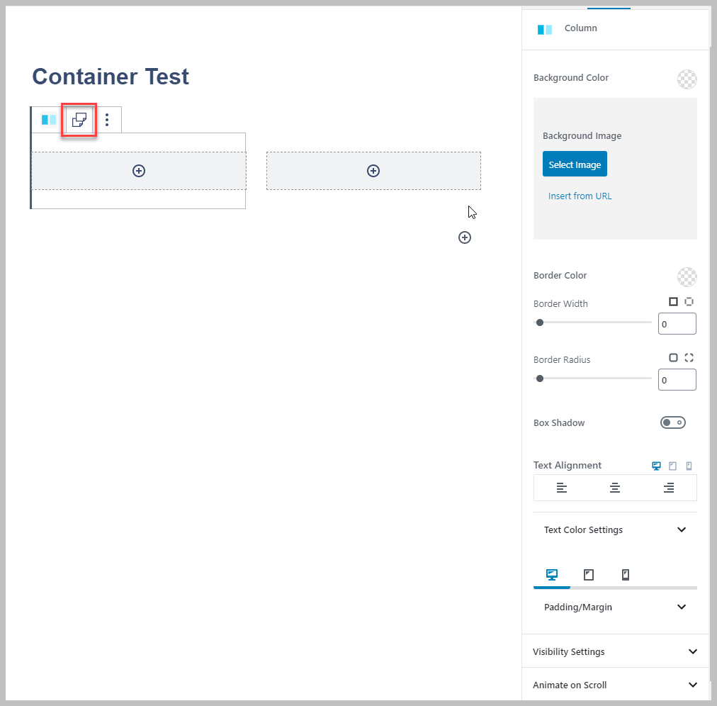
- On the top bar for the column block there is a Copy / Paste Styles option. If you add some styles to your column you can, like a drop shadow, you can copy it on one column and then paste the style onto another one. Neat.
- There are basic options: background color or background image, border options, shadow, and text alignment options.
- There are text color options for text and links.
- There are padding and margin options for the column.
- There are options to hide by device size.
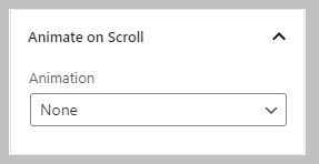
- There are Animate on Scroll options. You can see from the screenshot the partial list.
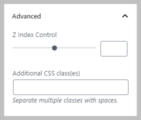
- And finally there are Advanced options for Z index (the layer level) and the ability to add CSS classes.
Advanced Container Layouts
It should be clear that the Row Layout block allows for very sophisticated layouts, but suppose you want to have multiple rows? Of course you could use multiple blocks stacked, but if you wanted to move them together as a unit or add background to the group, for instance, then being able to add multiple rows would be helpful. The Kadence Row Layout block has you covered.
To illustrate this I start by adding a Row Layout block and giving it a background color. I’m going to give each of the Row Layout blocks its own background color to make it easier to see what is going on. Here the first Row Layout block has been added with a single column, and a light grey background is set on the the row level.

I click on the circle-plus icon in the middle of that single column and add a second Row Layout block. I put a dark blue border around the first single column so you can see that it is holding the second block. I made the background of the second Row Layout block dark grey.
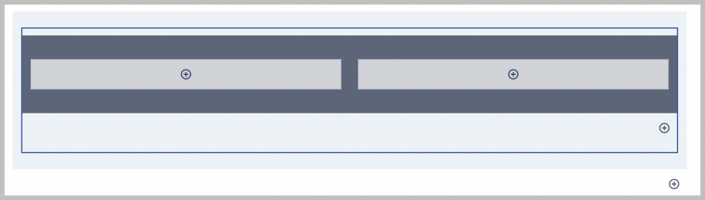
Now I add another Row Layout block into the container, underneath the dark grey one, by clicking the circle-plus on the lower right in the light grey area. I give it a red background.

Now I click on the circle-plus in the single red column and add yet another Row Layout block and give this one a purple background.
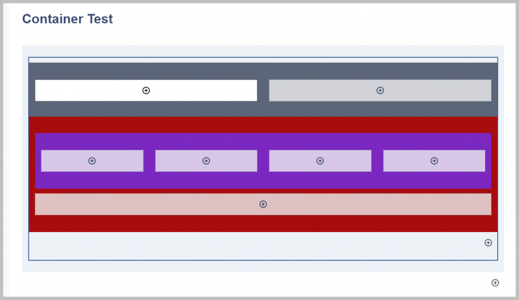
By using the Row Layout block as a container, it makes it possible to reorder the rows with their holders. One thing to be aware of is that you can loose the column highlight of empty single rows if you move things around. That column is still there but it is just there as a circle-plus icon. To move a row, first select it using the navigator, then click on the side up or down arrow.

Challenge – Duplicate an Elementor Block
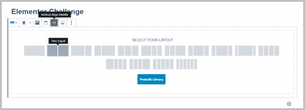
It is pretty clear that Kadence Row Layout block provides a ton of layout and style options, so I wanted to try and recreate a block layout from the Elementor library. Going into a page with the Elementor Page editor and clicking on the templates button, I scrolled through the list until I found one that looked interesting.

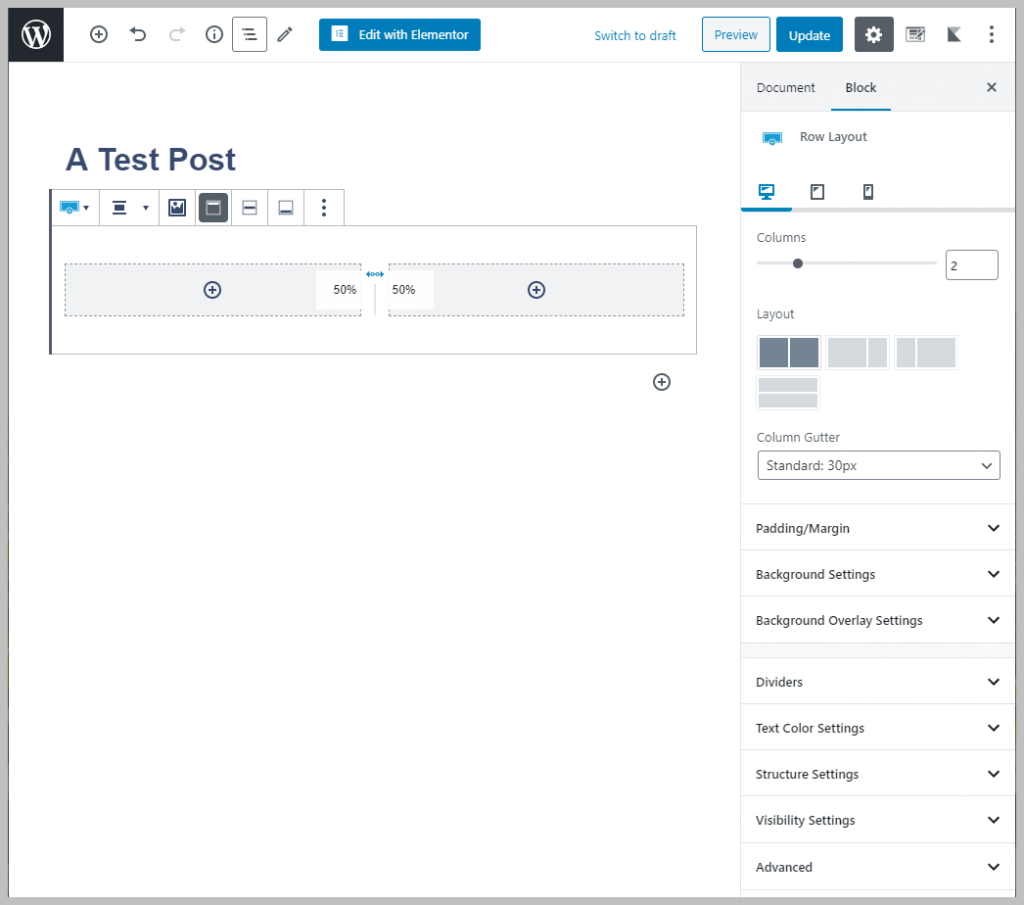
The first thing I did was start a new post and add a Kadence Row Layout block. I selected the middle align and two column layout.
I clicked on the button to add a background image to the Row Layout block.
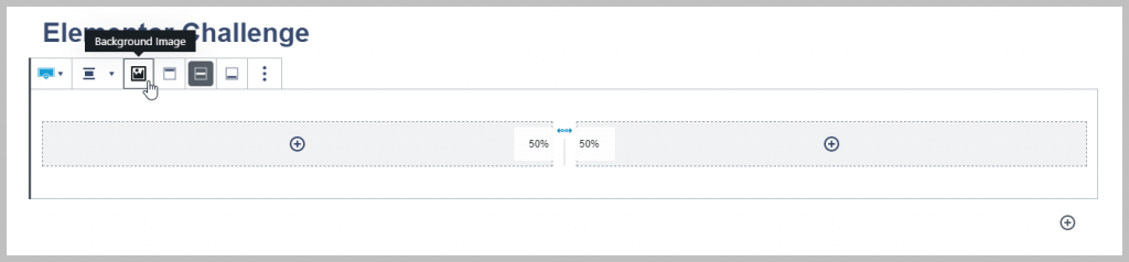
I added the background image from the Media Library that was used for the Elementor page.

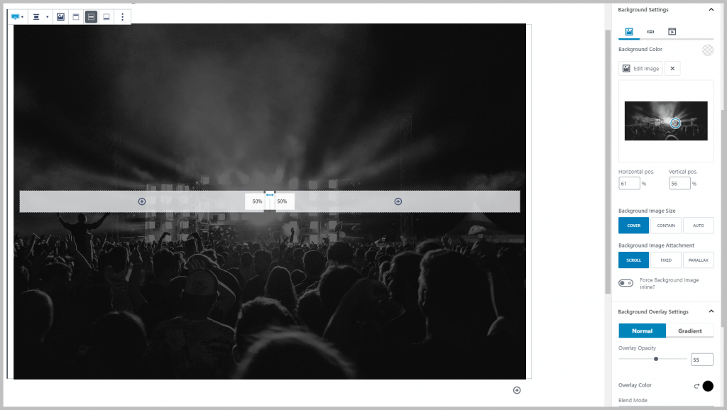
I used the Background Settings to adjust the focus target for the image and set the Overlay Opacity.
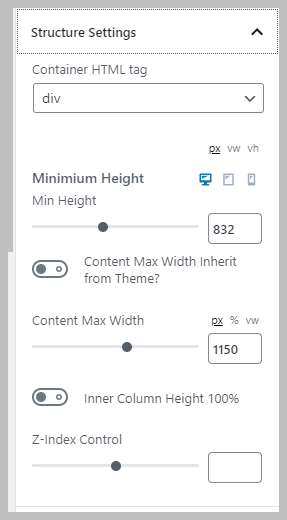
I also set the Structure Settings so the image showed. Setting the Content Max Width gave some right and left margin space for the columns.
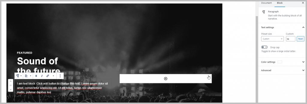
I added a Kadence Advanced Heading blocks and set the subtitle. I had to adjust the font size, letter spacing, and text transform.

I added another Kadence Advanced Heading block for the title. I adjusted the size and advanced typography settings. I had a hard time getting the heading to wrap where it was supposed to until I tried Shift – Enter (on Windows), which wrapped it as desired.

I added the text block and set the text color and font size.
I then added a Kadence Advanced Button block. There were a lot of tweaks to get the button settings: font size, padding, text transform, as well as text and background colors.

Next I needed to add the sound recording. I grabbed the URL from the Elementor page and tried the default WordPress Soundcloud embed block. I thought I was so clever, but it rendered as a large rectangle. That did not look anything like the Elementor example. I tried a few ways to force the size down without success.
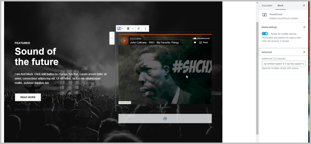
So I went to the Soundcloud website and found the recording there. Wouldn’t you know it? Soundcloud provides two player layouts and Elementor, was using the other layout.
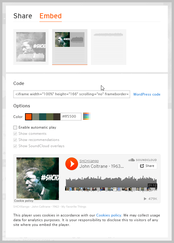
I copied the embed option for the compact player and pasted it into the right side column. The result wasn’t 100% exactly like the Elementor version, but it was very close with only modest effort. In fact, I imagine it would have taken the same amount of time if I had tried the same challenge in reverse, and tried to create it in Elementor. What do you think?

Summary and Conclusions
I got the Kadence Membership when I switched this site over to using the Kadence theme. For this site I knew I was going to be using Gutenberg and I wanted a theme that worked well with the block editor. Both the Kadence Theme and Kadence Blocks have good Customizer to Blocks integration, the color palette and linked colors for example. This extra theme-to-editor integration was explored in the first part of this tutorial. This kind of synergy with the theme is not required, but it is icing on the cake.
The free version of Kadence Blocks has twelve blocks and the Pro version adds 10 blocks and extensions. In this tutorial I only looked at one block in detail. The Row Layout block is a feature rich and flexible container block. When I first looked at the Row Layout block I was a bit overwhelmed. Stepping through each of the panels, and looking to see what options each adds, made it less intimidating and helped me with the “Elementor to Gutenberg Challenge.” When replicating the Elementor block I had a good idea where to look for each layout option I needed. The Row Layout block gives Gutenberg some page builder like abilities much beyond what WordPress core offers.
Kadence Blocks has some unique features, such as the ability to set block defaults and the ability to limit access to style options on a per block basis. We didn’t even look yet at the template library or the other blocks and extensions, but I hope that by following along with my walk-through and tutorial you also become comfortable and familiar with Kadence and can decide if you want to give it a try.

I’ve been avoiding Gutenberg since it’s release, but after studying a few different Kandence Blocks videos over the past few day; I think I’m going to start making a small journey in Gutenberg via Kandence Blocks and the Kadence Pro theme ….. I still think Gutenberg on it’s own is still weak, but when you throw Kadence Blocks and a powerful theme like Kadence Pro together – suddenly I can see a little bit of light at the end of the tunnel for Gutenberg.
Still noticing lots of negative feedback being left on the Gutneberg WordPress.org review page though.
Hi Dean,
Yes, Gutenberg is still a work in progress. It has a learning curve and I don’t think people find it intuitive, but once you find your way around you can use it. There are still rough edges that can be frustrating. Like you, I’ve found that tools like Kadence and Kadence Blocks definitely make the process better.
Very helpful. Thank you! I’ve been trying to figure out this kadence stuff. Putting the blocks within the blocks and coloring them is a great illustration. I love how you copied the other webpage. What photography company did you work for? I do photography in Northfield, MN. I’m going to use Kadence to match this theme on my website: http://www.joemillerphotography.com
Hi Joe,
I’m glad you found the tutorial useful and thank you for the positive feedback. I used to work for Chappell / Marathonfoto / GradImages / Event Photography group (it was acquired etc over the years). Interesting that you are switching from an Imagely theme as they target photographers. I hope it goes smoothly for you. Kadence has a pretty active Facebook group, if you are not already a member.
Regards,
David
Actually Imagely just updated to 2.0 and uses Kadence. I guess I’m not building from scratch, but trying to figure out how to modify the same theme in 2.0 to what I had with the same theme in version 1. I hope that makes sense.
Thank you for sharing that information. I didn’t know and hadn’t seen any mention of it.
Thank you, thank you, thank you! I just finished watching this tutorial and have much more clarity on Kadence blocks. I’m a newbie in the process of building a “simple” website using Gutenberg and Kadence Blocks and your instructions and explanations on the various options are going to take my basic understanding to the next level! One thing I continue to be unsure about is the use of the term “section” in the navigation panel. I don’t understand the difference between row layout, section and column. Can you clarify that for me?
Hi Patricia,
You are welcome. I’m glad it was helpful. Sorry, I may have not been using the word “section” clearly enough. In Elementor, “section” is the content container, It really outputs to HTML DIVs. The Kadence Row Layout Block’s “Rows” and “Columns” also boil down to DIVs. So there is nothing about the content that we need to think of in terms of sections. I also used “section” to refer to the settings area on the right and maybe to the tab areas. I hope that clears it up.