
Table of Contents
Introduction
WordPress natively supports custom fields and the ability to create Custom Post Types, but WordPress doesn’t by default provide any way to show them on the front of the site. There are a large number of third party options to solve this. This series on Custom Post Types and Theme Builders has looked at a number of these solutions and this tutorial looks at Meta Box Views. In part nine of the series we looked at how to create a Custom Post Type using Meta Box. Now we turn to Meta Box Views, the Meta Box extension for creating content templates for Custom Post Types.
Video Version
The Challenge
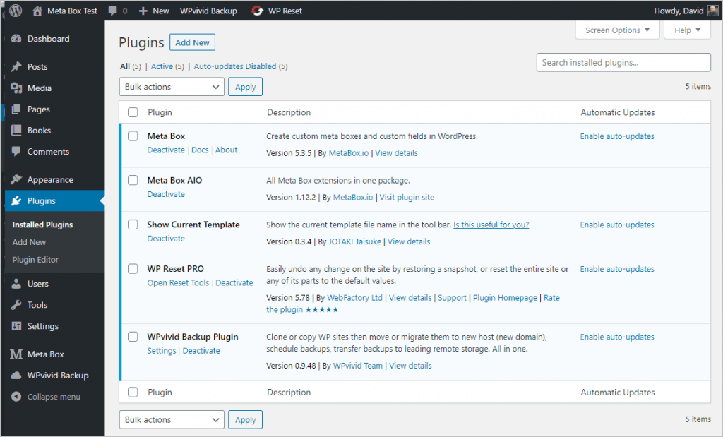
I have a test site setup using the free Kadence theme. Here are the installed plugins. Meta Box is the core “framework” plugin that doesn’t have a user interface, but provides functionality for all of the extensions. Meta Box AIO, or All in One, is only available with the higher premium plans and as the name implies, provides access to all of the Meta Box extensions.
I use WP Reset Pro amd WPVivid to reset the site between testing sessions.
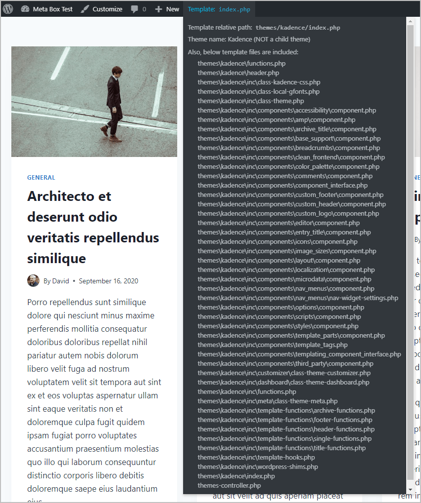
I also have the Show Content Template plugin installed. This shows you what theme files are loaded for a page on the front of the site. It turns out I didn’t need it, but it is useful if you are doing manual theming. Here is a screen shot of what theme files are used by Kadence to show the blog home page.
In simpler days you could just edit a theme template or two to create you Custom Post Type template, but these days everything is very modular so that route would take a lot of digging.
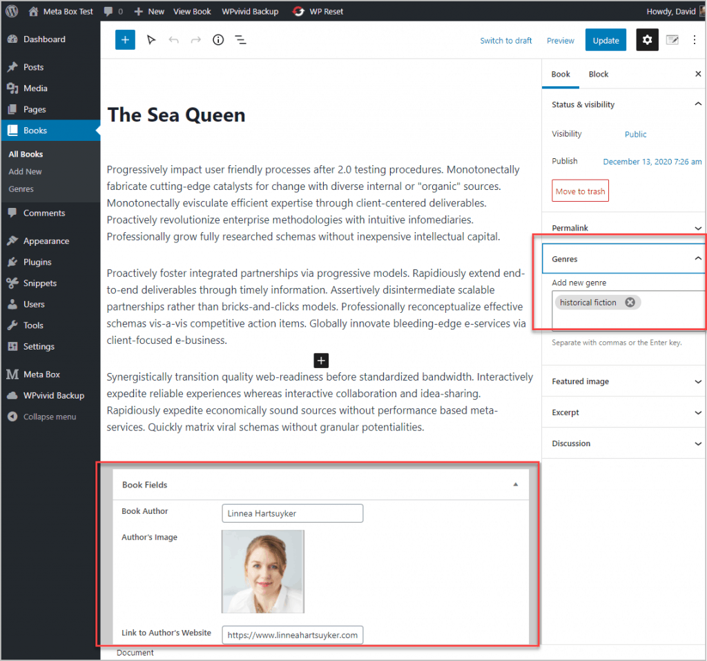
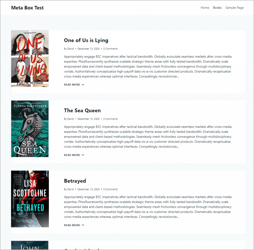
I used Meta Box to create a Custom Post Type called Books, which has three custom fields: the book’s author, a link to the author’s website, and a photo of author. The Book Custom Post Type also has a custom taxonomy called Genre. I entered some book records and here is one in the Gutenberg editor.
Here is this record on the front end. You can see that the featured image is huge and there is no way to adjust that in the theme Customizer. Also, none of the custom fields show. So, we will need to do some theming to fix this.

The book archive page looks better, but the featured image is still too large.

Meta Box Views Overview
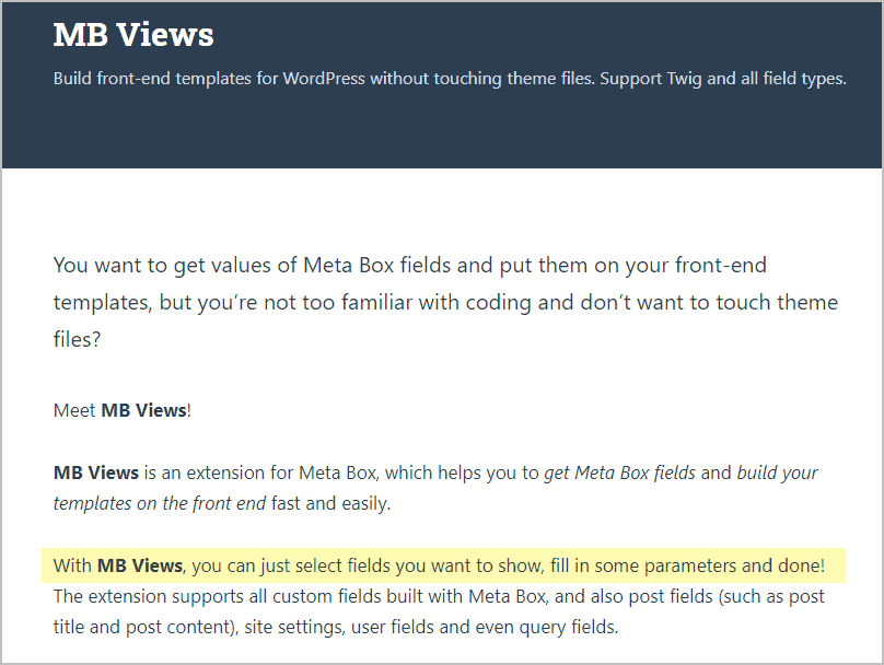
The Views extension is the Meta Box solution to these problems. Here is the Meta Box page for the Views extension. Note the highlight which tells the user how easy this is going to be.
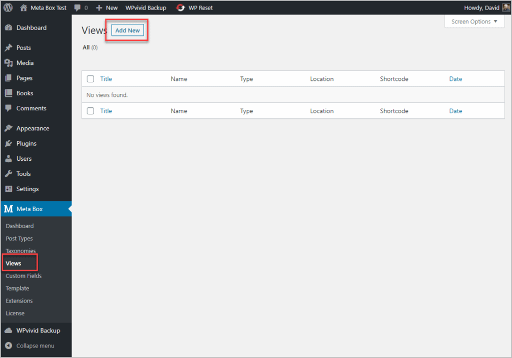
You access the Views user interface by clicking on the Views menu item, under Meta Box, in the admin menu. There you start with a screen saying Add New.
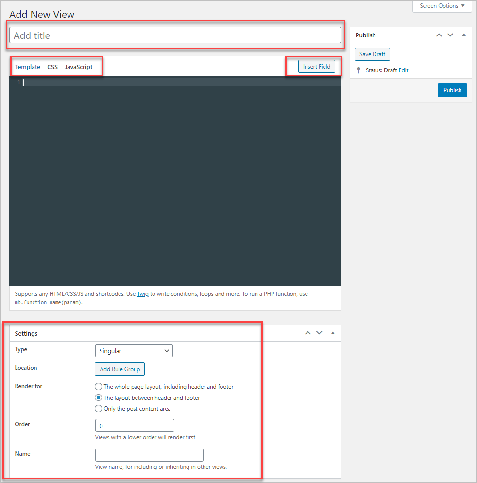
When you go into the new View screen you see several areas and controls. At the top is where you name your View. Below that, on the left, are three tabs: Template, CSS, and JavaScript. These areas are where you add your code. To the right of that is a button that gives you a slide out panel of dynamic variables you can use. Below that is the editor. Then below the editor is a settings area where you define the rules of what the template will be applied to.
Creating the Single Template
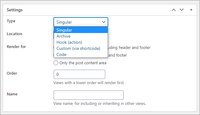
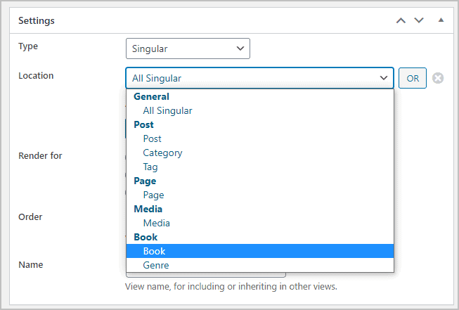
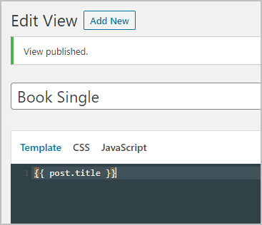
I gave my View the name Book Single and then in the settings area I specified what Type of View it was going to be. The options are Singular, Archive, Hook, Custom and Code. So, you can see from the last three choices that the you can create templates to use via a hook, shortcode or code, and not just for theme single pages and archives. I selected Singular since this is to be the template for showing single book records.
In the Location area you set the rules for what theme parts you want to use the template for. I selected Book.
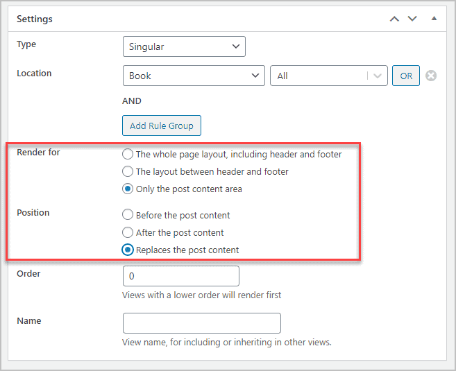
Then there is a Render for section. You can replace the entire page, only the part between the header and footer, or the just the post content area. There is also a Position option if you wanted to show something above or below the content or replace the content. I want to let the theme do as much as possible, so I selected “Only the post content area” and “Replace the post content”. Order and Name are used if you have multiple Views used together, which doesn’t apply here.
I clicked Publish to save my choices and start.
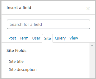
Now that we have chosen what the template is for, the options in the Insert Fields panel are filled in. There are several tabs, each with their own groups of fields. The Post tab has many of the default Post Fields as well as the Book Fields and the Term Fields.
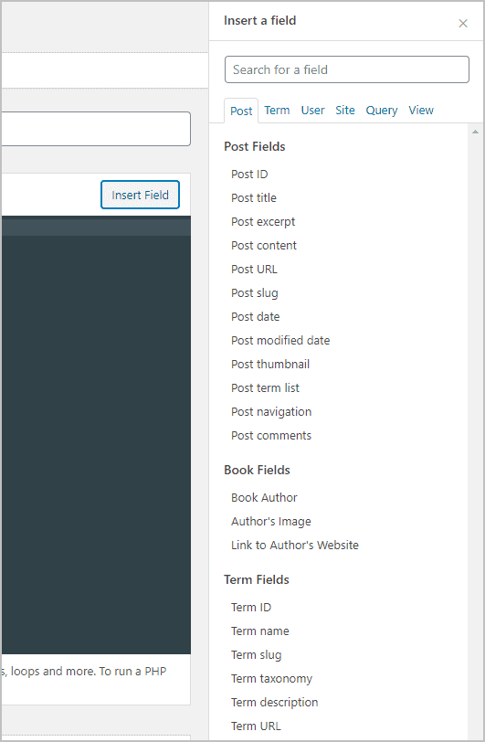
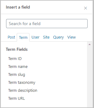
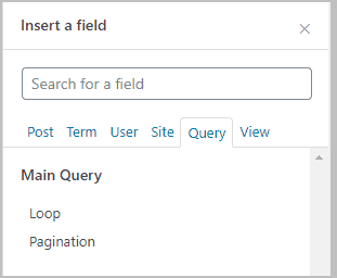
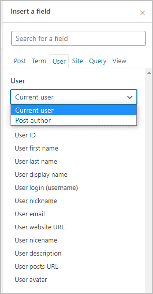
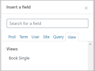
Here are the fields available from the other tabs. Note the User tab has a drop down where you can switch between the Current user and the Post author. The Query tab is used for when you need to loop, like for the archive. The View tab is where you can nest in another View.
I tend to build stuff up step by step, so to get started, I just clicked on the Post Title tab and saved the View. Note the fields are added in between two sets of curly braces.
I then went and looked at a single record on the front. The only thing that changed was that the post content only showed the post title. I guess that makes sense as that is what I picked to replace. Honestly, if the featured image worked then I would have left the featured image and post meta and just focused on the content area, but the image was a problem.

Many page builder friendly themes give you the option to disable the featured image, post meta, etc. Kadence is no exception. In fact, a nice feature of the Kadence theme is it gives you some options for customizing the single and archives of Custom Post Types. So, I went into the Customizer settings.

And this is what it looked like after I toggled off the title, meta, and featured image.
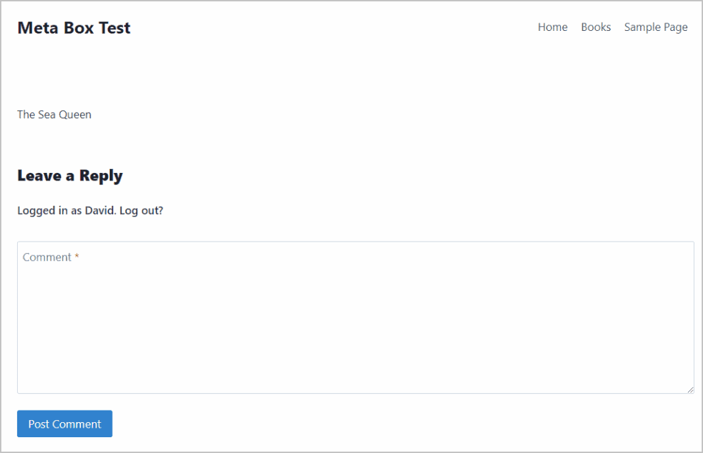
Kadence has the option to turn off comments also, and Meta Box has the option to add them where you want, but the default placement is fine, so I left them on at the bottom.
What I want to achieve is a two column layout with the featured image and the custom fields on the left, and the title, post meta, and content on the right. Meta Box lets you use any CSS and JavaScript that you want, but I think it is always better to leverage off of what the theme is using, if possible. So, I did a search in the Kadence theme forums and found that it is not using any special framework, but only CSS grid, which pretty much all browsers support.
At this point, I’m going to show the steps I took in building up the single book template, but what I am showing is the final result in each step. I did LOTS of Googling and experimentation, and it took a few hours to create it. Of course, this was the first time using Meta Box Views, so that is not unreasonable, but I don’t want to give the impression that I just clicked some buttons and knew off the top of my head all the answers.
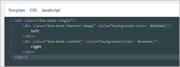
As I said, I like to build things up in stages, so I started with the column structure. Here is the HTML added into the template editor. The way that CSS grid works, is you declare the intent to use a grid on the parent DIV, so the “dcm-book-single” one is the parent. In retrospect, I should have named the other two DIVs “left” and “right” or something, but that is what they are the first one “dcm-book-featured-image” will be the left column and the “dcm-book-content” DIV will be the right column. Note the inline background color styles. I will remove those later, but for starting out I want to see if it is working. Note also that I put the words “left” and “right” in the columns. I did that because nothing shows on the front if the DIVs are empty and also so I can see how the should fall later.
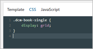
Then in the CSS tab, I declared the grid on the “dcm-book-single” DIV.
And here is what we have on the front.
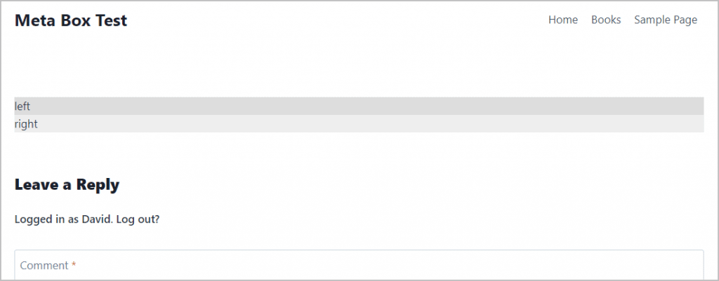
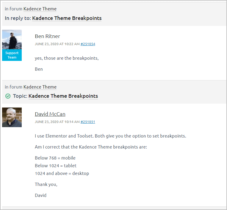
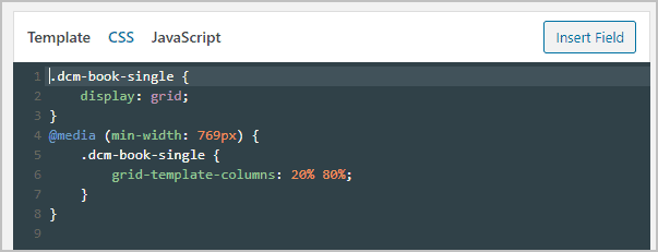
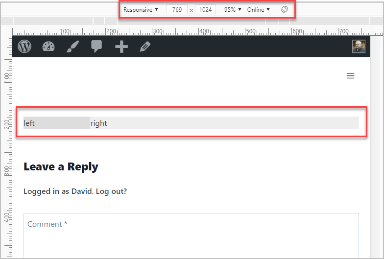
Note that the DIVS are stacked and not side-by-side. That is because we haven’t added any CSS saying what we want done yet. That is done on purpose because for mobile we want them to stack, so that is the default. Now we need to add some CSS to say that on tablet and desktop we want columns. You do that with a media query. If only every theme published their breakpoints! Again, I went to the Kadence theme forum on the Kadence website and did a search for breakpoints. I found my own question asked and answered by the developer back in June!
So, now I updated the CSS to add the breakpoint and grid code. It defines two columns, one 20% of width and the other 80%.
I checked the code using the Chrome dev tools, device testing and it looked good.
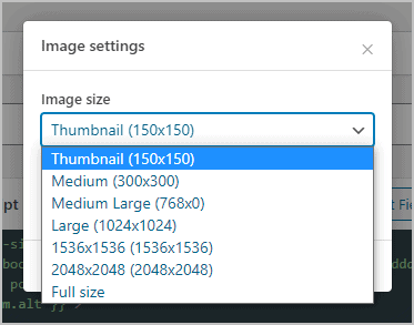
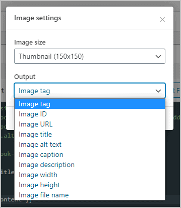
Now to start adding content. Back in the template editor, I added the featured image to the left, and the title and content to the right. Note that when I clicked the Add Fields, Post thumbnail field there was a popup where I could pick the size and which image information I wanted.
And this is what we have on the front-end, which seems like a good start.
I added some CSS to size and center the featured image, also to push it down a bit. I also added some padding to the content div.
And now here is what things are looking like.
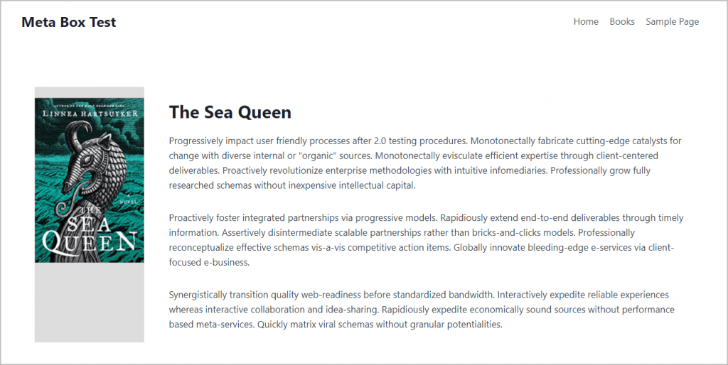
Now, to add the post meta. I added the author and post date from the field list, but there was no field to pick for the comment count. I found in the Meta Box documentation that Views has a “proxy” where you can call any WordPress function. The syntax for that is you write the function with a “mb.” prefix. So I found in the WordPress codex the function for the number of comments and added that funciton:
{{ mb.get_comments_number() }}The ability to use any WordPress function is a very powerful feature. Here is my template with the post meta.
And here it is with the post meta on the front.
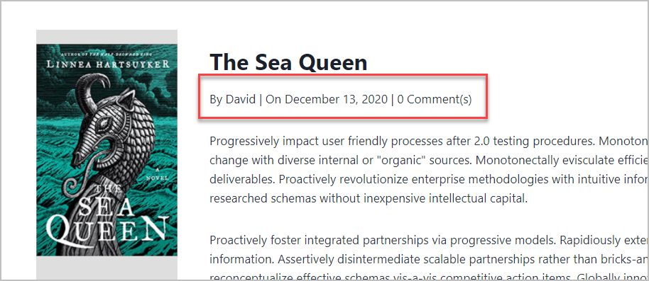
If this were really being used on my site, I would turn the place where the author’s name is into a link to the author’s archive and the number of comments to a link to the comment area. Also, wouldn’t it be nice to add icon decoration for the post meta. Those additions would be great, but it would be pretty time consuming to add that … so I apologize for skipping it, but I spent a long time getting this far.
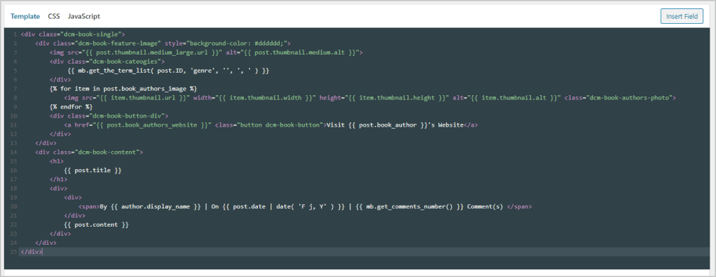
Now to add the custom fields. My plan is add them under the featured image. I put the taxonomy terms into a DIV and employ the “mb.” proxy to call a WordPress function to output taxonomy terms (with a comma between them if there is more than one). I also but the button with a link to the author’s website in its own DIV. I thought the DIVs would help in adding space between elements. Picking the custom fields was easy, just clicking on them in the panel. Note that the author’s image output a slightly different syntax for a loop, because the control in the book editor allows for more than one image. Also, note that I just added the class of “button” to the button. That seemed like a good guess and I think that is a Kadence default, but I didn’t go research. I was happy to see I got a button out of the anchor tag.
Here is the progress so far on the front.
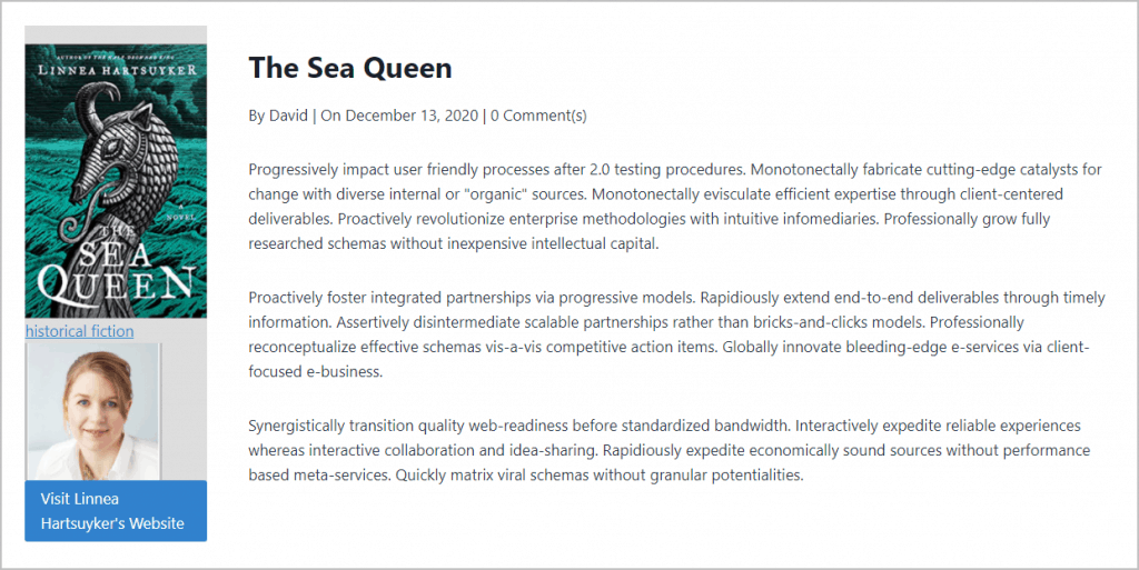
The last task then was to do some final styling. I noticed that the other pages in the theme had a very light blue background and the content area was white. So I added CSS for that. I also removed the last inline style and added CSS for the genre, author’s photo, and the button. Here is the final template for the book single.
<div class="dcm-book-single">
<div class="dcm-book-feature-image">
<img src="{{ post.thumbnail.medium_large.url }}" alt="{{ post.thumbnail.medium.alt }}">
<div class="dcm-book-cateogies">
{{ mb.get_the_term_list( post.ID, 'genre', '', ', ' ) }}
</div>
{% for item in post.book_authors_image %}
<img src="{{ item.thumbnail.url }}" width="{{ item.thumbnail.width }}" height="{{ item.thumbnail.height }}" alt="{{ item.thumbnail.alt }}" class="dcm-book-authors-photo">
{% endfor %}
<div class="dcm-book-button-div">
<a href="{{ post.book_authors_website }}" class="button dcm-book-button">Visit {{ post.book_author }}'s Website</a>
</div>
</div>
<div class="dcm-book-content">
<h1>
{{ post.title }}
</h1>
<div>
<div>
<span>By {{ author.display_name }} | On {{ post.date | date( 'F j, Y' ) }} | {{ mb.get_comments_number() }} Comment(s) </span>
</div>
{{ post.content }}
</div>
</div>
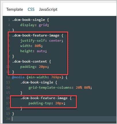
</div>Here is the final CSS.
#inner-wrap {
background-color: #f7fafc;
}
.dcm-book-single {
display: grid;
background-color: #ffffff;
}
.dcm-book-feature-image {
justify-self: center;
width: 80%;
height: auto;
}
.dcm-book-content {
padding: 20px;
}
.dcm-book-authors-photo {
margin-left: auto;
margin-right: auto;
width:150px;
padding: 25px 0px;
}
.dcm-book-cateogies {
text-align:center;
justify-self: center;
width:90%;
padding-top: 25px;
}
.dcm-book-button {
text-align: center;
}
.dcm-book-button-div {
width:90%;
margin-left: auto;
margin-right: auto;
}
@media (min-width: 769px) {
.dcm-book-single {
grid-template-columns: 20% 80%;
}
.dcm-book-feature-image {
padding-top: 20px;
}
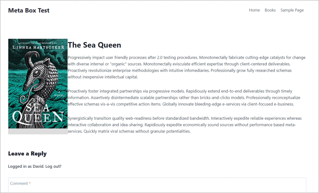
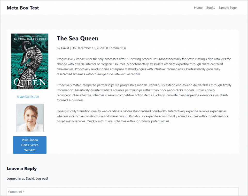
}And finally, here is the finished template on the front end.
Creating the Book Archive Template
You get started the same way as before, by clicking the Views menu item, then Add New and giving it a name and picking from the settings. Here is my beginning of the Book Archive template.
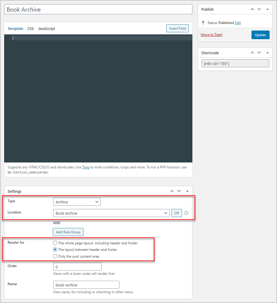
I gave it a name of Book Archive and set it for Archive / Book Archive. This time I decided to go with everything between the header and footer.
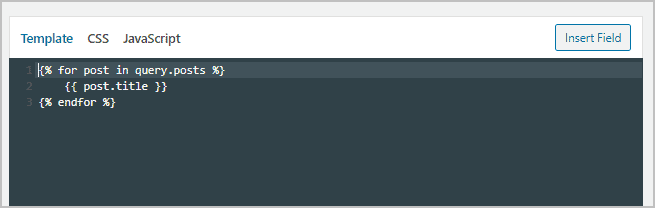
I added to the template the loop function from the field query tab. And inside the loop I added the post title.
And the output on the front.

So, this is output right up against the header. I took a look at the page source and saw this as what Meta Box was outputting. Notice that the header and footer are directly above and below it. Notice that this content is inside a DIV called “inner-wrap”.
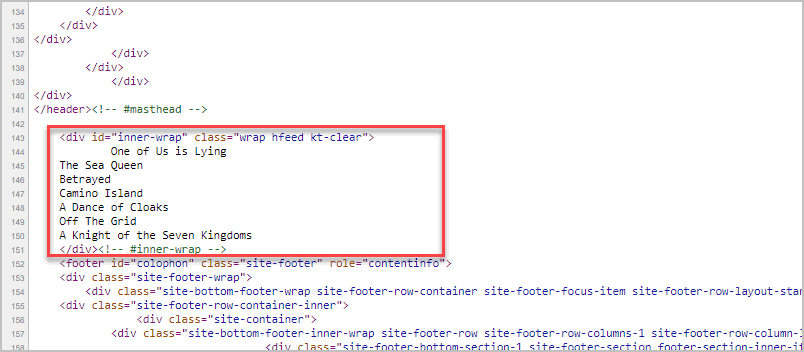
Hmmm, something told me that proceeding as is would be a mistake. Most themes output a lot of wrappers above and below the content, so I set this Meta Box template to draft and looked at the source code that Kadence outputs by default. Why do this? Because I want to use the theme styles as much as possible and not reinvent the wheel.
I copied that source into a code editor and noticed that each of the books in the archive is in an “article” section. So, I deleted all but one of them. This left me with some code at the top and bottom of the archive.
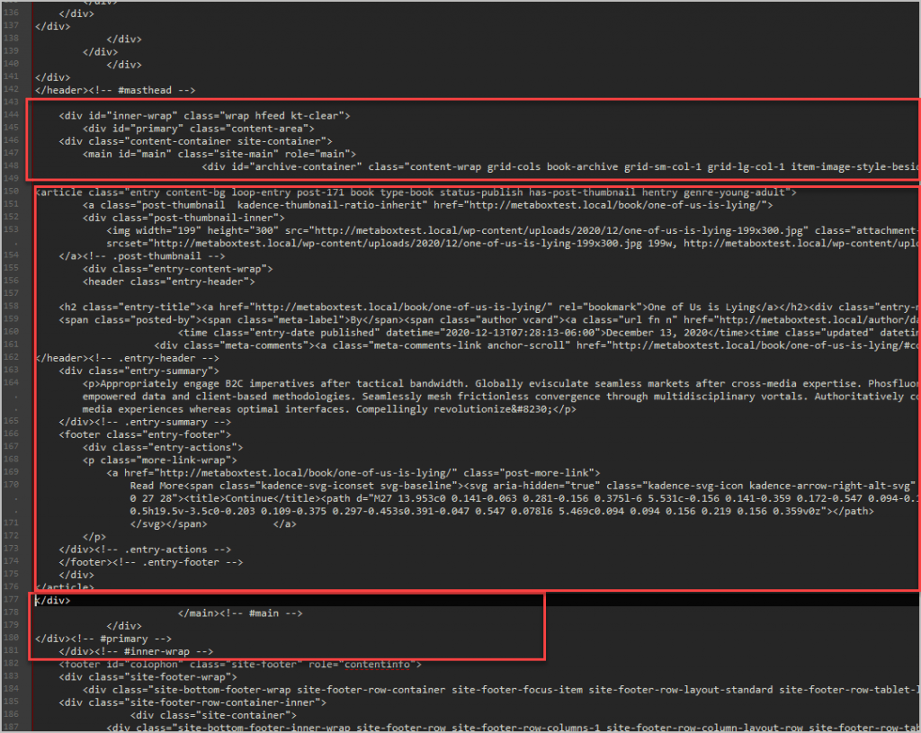
My conclusion was that I wanted to keep something similar above and below the loop in the Meta Box archive template. So, this is what I ended up with after a lot of trial and error. I used as many of the DIVs and classes as possible from the theme and put the loop in the middle.
I wanted to create the grid, so, in the loop I added the opening and closing article tags and gave the article a class of “dcm-book-archive”. This would be the grid container. I added two DIVs inside that, one for the image on the left and one for the other content and put in some placeholder text.
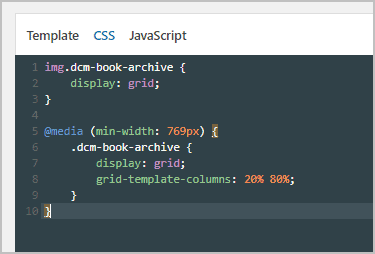
I added the CSS to declare the grid container and to put the two inner DIVs into columns for tablet and desktop. This should look familiar from the book single.
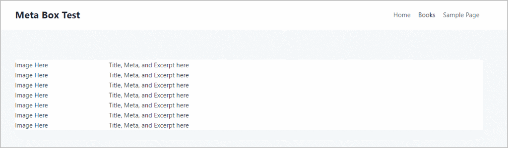
So far, this is what it looks like on the front.
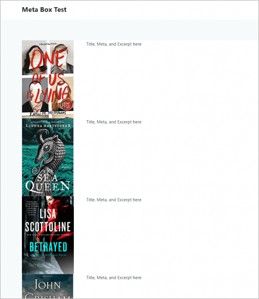
Next, I added in the featured image into the first column.
And here that is on the front.
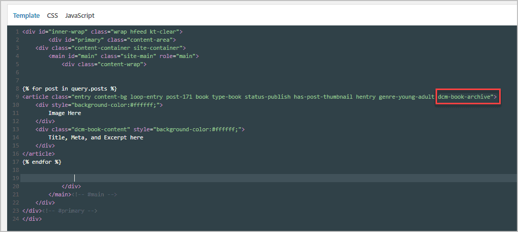
At this point I decided to take a short cut and went back to the source code in the editor from the Kadence version of the book archive. I copied out all of the content code and pasted that into the second column.
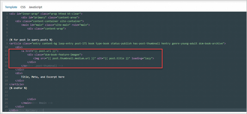
I then went through and everywhere there was static content I replaced it with a variable field. This was a bit tricky, so I did it bit by bit. Here is the final template. I added a spacer div after the closing article tag so there would be some space between the rows. I also added the Meta Box paging tag from the query panel so there would be page numbers if there were enough articles to require them.
<div id="inner-wrap" class="wrap hfeed kt-clear">
<div id="primary" class="content-area">
<div class="content-container site-container">
<main id="main" class="site-main" role="main">
<div class="content-wrap">
{% for post in query.posts %}
<article class="entry content-bg loop-entry post-171 book type-book status-publish has-post-thumbnail hentry genre-young-adult dcm-book-archive">
<div style="background-color:#ffffff;">
<a href="{{ post.url }}">
<div class="dcm-book-feature-imagee">
<img src="{{ post.thumbnail.medium.url }}" alt="{{ post.title }}" loading="lazy">
</div>
</a><!-- .post-thumbnail -->
</div>
<div class="dcm-book-content" style="background-color:#ffffff;">
<div class="entry-content-wrap">
<header class="entry-header">
<h2 class="entry-title"><a href="{{ post.url }}" rel="bookmark">{{ post.title }}</a></h2><div class="entry-meta entry-meta-divider-dot">
<span class="posted-by"><span class="meta-label">By</span><span class="author vcard"><a class="url fn n" href="http://metaboxtest.local/author/{{ author.login }}/">{{ author.display_name }}</a></span></span> <span class="posted-on">
<time class="entry-date published" datetime="{{ post.date | date( 'F j, Y' ) }}">{{ post.date | date( 'F j, Y' ) }}</time><time class="updated" datetime="{{ post.date | date( 'Y-m-d H:i' ) }}">{{ post.date | date( 'F j, Y' ) }}</time> </span>
<div class="meta-comments"><a class="meta-comments-link anchor-scroll" href="{{ post.url }}#comments">{{ mb.get_comments_number() }} Comments</a></div></div><!-- .entry-meta -->
</header><!-- .entry-header -->
<div class="entry-summary">
<p>{{ mb.get_the_excerpt() }}</p>
</div><!-- .entry-summary -->
<footer class="entry-footer">
<div class="entry-actions">
<p class="more-link-wrap">
<a href="{{ post.url }}" class="post-more-link">
Read More<span class="kadence-svg-iconset svg-baseline"><svg aria-hidden="true" class="kadence-svg-icon kadence-arrow-right-alt-svg" fill="currentColor" version="1.1" xmlns="http://www.w3.org/2000/svg" width="27" height="28" viewBox="0 0 27 28"><title>Continue</title><path d="M27 13.953c0 0.141-0.063 0.281-0.156 0.375l-6 5.531c-0.156 0.141-0.359 0.172-0.547 0.094-0.172-0.078-0.297-0.25-0.297-0.453v-3.5h-19.5c-0.281 0-0.5-0.219-0.5-0.5v-3c0-0.281 0.219-0.5 0.5-0.5h19.5v-3.5c0-0.203 0.109-0.375 0.297-0.453s0.391-0.047 0.547 0.078l6 5.469c0.094 0.094 0.156 0.219 0.156 0.359v0z"></path>
</svg></span> </a>
</p>
</div><!-- .entry-actions -->
</footer><!-- .entry-footer -->
</div>
</div>
</article>
<div class="dcm-row-spacer"> </div>
{% endfor %}
{{ mb.get_the_posts_pagination() }}
</div>
</main><!-- #main -->
</div>
</div><!-- #primary -->
</div>Here is the final CSS for the archive.
img.dcm-book-archive {
	display: grid;
	background-color: #ffffff !important;
}
.dcm-row-spacer {
	height:40px;
	background-color: #f7fafc;
}
@media (min-width: 769px) {
	.dcm-book-archive {
		display: grid;
		grid-template-columns: 20% 80%;
	}
	.dcm-book-feature-image {
		padding-top: 20px;
	}
}
Here is the final archive on the front end.
Discussion and Conclusions
One thing that became instantly clear was that the marketing blub “With MB Views, you can just select fields you want to show, fill in some parameters and done!” should not be relied upon when planning how long it will take you to create Views. This is true at least for the first few times that go through the process. It took me the good part of a day to create the single and archive template. I imagine once you have done it a couple of times, that you would have a library of code to use on new projects and it would go quickly.
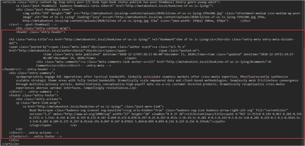
When I created the archive I took a shortcut and copied in the HTML from the Kadence theme’s version of the article loop. This turned out to be a good idea, especially for the post meta as it inherited the styles and the author and comment meta had the links to the author’s archive and the article’s comments. If I had done something like that for the single template then I could have picked up the styles and meta links for that also.
One thing you cannot see in screenshots is how it was using the code editor. I guess it was better than notepad, but at times it was painful. First, since I was experimenting and building things up in steps, I would sometimes delete some code, save, and then go to the front to test. If it didn’t work and I wanted to control-z to undo the change that was not available. Once you save the clipboard is cleared. You can imagine how that was frustrating as I’d have to try to remember what I deleted. I guess I’m spoiled with visual editors where you see your changes in real time. If you have two monitors then I’d recommend having the preview page on the second monitor. On the plus side, tag matching worked well, so you could highlight a line with a DIV and the closing DIV down the editor would be highlighted as well.
The panel with the fields that you could insert was helpful and the ability to use the Meta Box proxy syntax is very powerful. I didn’t really have to get into twig that much, but I’ve used it before and I’m generally a fan. Having the CSS and JavaScript tabs is a plus because then your styles and JavaScript code are only loaded when that template is used, which is a nice convenience. I didn’t see a way to queue a stylesheet or JS file, or load other resources from within the Views editor. I did not show adding a custom field to an archive, but doing so would be the same process as in the book single template and as trivial as adding a field from the side panel.
My conclusion is that Meta Box Views is a developer or power user tool. If you are used to the Elementor Theme Builder then using it will feel like torture. However, if you put performance and code optimization first, then you won’t mind the process. It is all very light-weight, it is very powerful, it is a step up from creating PHP theme templates, but a very similar experience.

Hi David,
that’s an exciting and honest walk-through, I admire your ability, patience and persistence in digging up all the needed bits and parts to finally achieve what you were aiming at, so, hats off!
I am making good progress with the PTB, but seeing the sheer potential and all the available extensions of the Meta Box plugin, I have a feeling this is going to be on my shopping list at some point in time. Right now it would still mean punching above my weight, but it was encouraging to see that not every line has to be hand-coded, as all the fields in the side panel, the proxy syntax, the WordPress Codex, and, last but not least, a good look at the theme’s div structure obviously can be of great help. So that’s encouragement enough to try to get better. 🙂
Thank you for another great review!
Happy holidays and best wishes
Chris
Hi Chris,
Thanks. It was a little more work than I expected, but I’m glad to understand and be able to share what Meta Box Views is all about.
It is nice to hear that you are making progress with PTB.
Hope you have great holidays.
David