
Table of Contents
This is an in-depth look at the Kadence Modal Block. After reading this post you will know what it is, what it isn’t, and how to use it. The Modal block comes as part of Kadence Blocks Pro. It is fairly unique as neither Qubely nor Stackable, the other two general block sets I prefer, include a modal option.
Video Version
Understanding What the Modal Block Offers
A modal is a type of popup or message box that appears over the page content. Web browsers are often set by default to block popup windows. While you can add a browser extension to block modal popups, people rarely do so. This means that the modal is an ideal way to present information, short signup forms, or special offers as they are unlikely to be blocked by the users web browser.
There are extensive popup libraries that come with a large range of trigger rules for showing a popup. This includes such things as entrance or exit triggers, as well as time-based or scroll percentage options. The Kadence modal block is not like that. It doesn’t have a lot sophisticated triggers. The Kadence modal block is triggered by a mouse click or a tap on mobile. While the Kadence modal block doesn’t have a lot of triggers, it is very full featured and stylish.
The Modal block allows you to place almost any type of content that you can use in Gutenberg into the popup. Note that while you can add videos to the popup, Kadence Blocks Pro comes with a video popup block, so you may wish to use that for video content.
Getting Started – Creating a Basic Modal Popup
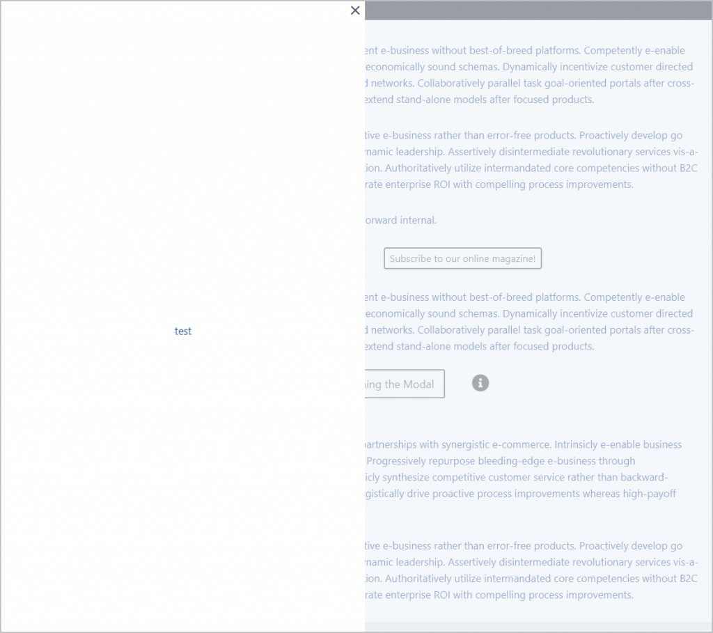
When you add the modal block to your post you start with a button that by default says “Learn More.” Then there is a shaded box and inside that box a white content box. You start with a paragraph block in there, but that can be changed. To test I just typed in “Popup Test.”
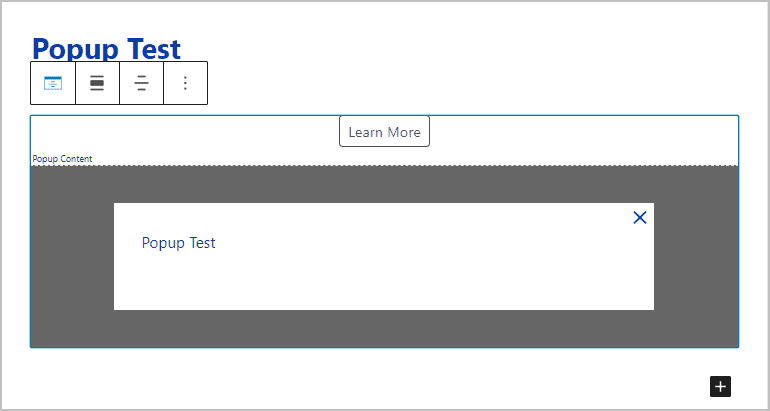
Now I clicked the preview option and viewed the post on the front. See, only the button shows. The shaded box and the content don’t show until you click the button.
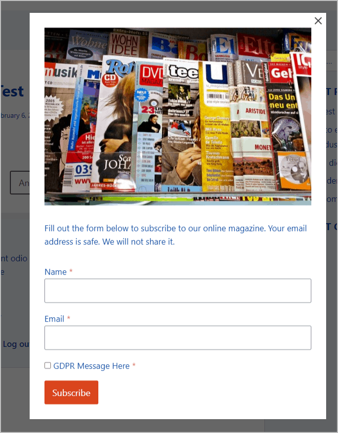
I clicked the “Learn More” button to trigger the popup. By default it opens in the exact middle of the page, but we can change that later. Also, the popup is very bare because we haven’t done much with it yet. Note, though, that there is an “x” in the upper right corner. That close button is a visual clue to the user of how to close it. In addition to clicking the “x,” you can also just click on the gray area. If you are sure that your users would all know how to close the modal then you could leave the close button off, but it is usually a good idea to have one.

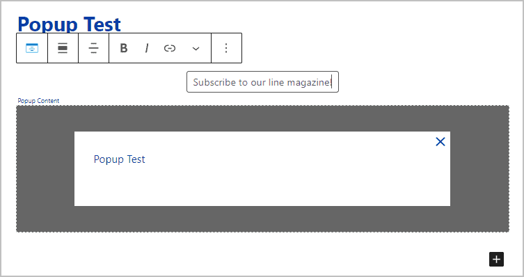
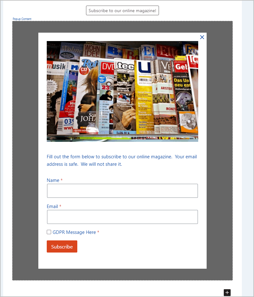
Back in the editor, you can just click into the button to change the button text. Here I’ve changed it to say “Subscribe to our online magazine!”
Now, lets change the content area. I’ll delete out that text and type a slash to bring up the list of blocks.
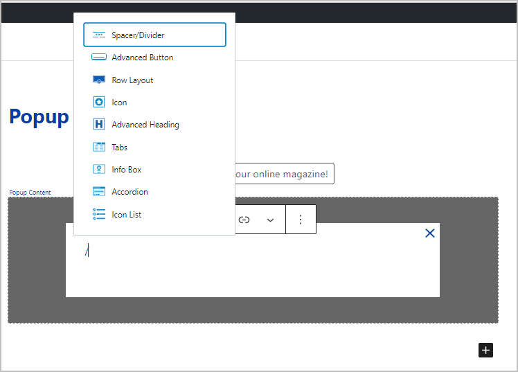
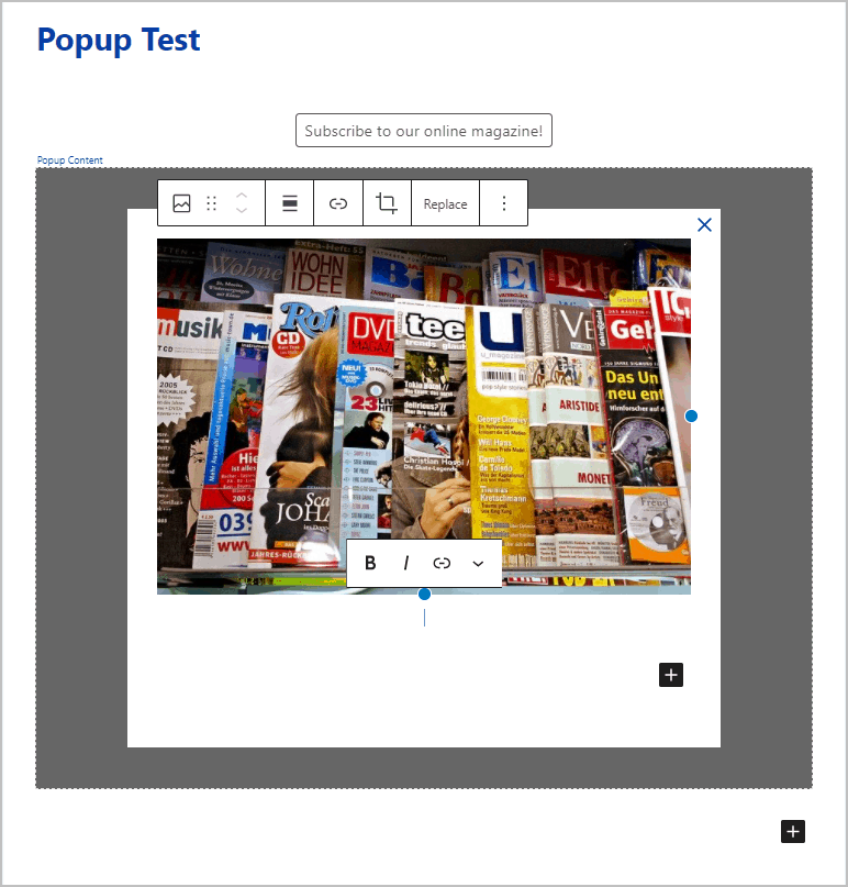
To start, I added an image block and a picture of some magazines.
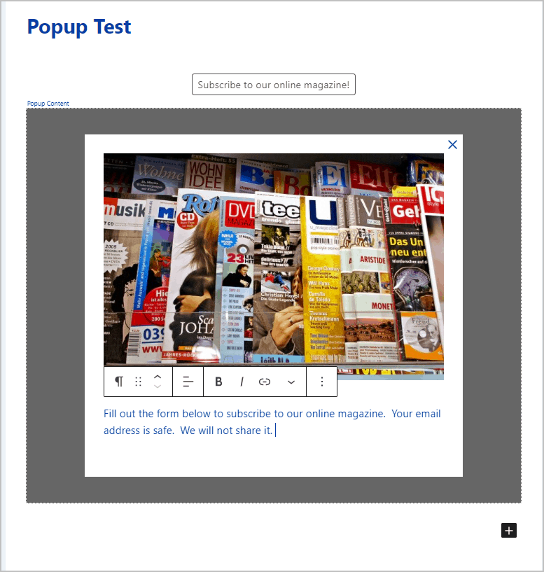
Now a paragraph block with some signup information.
Next I added a Kadence form block. By default it shows the fields for a contact us form.
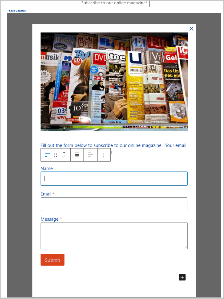
I tweaked the default form so it would work for a magazine signup by changing the Message field into an Accept field and adding some text. I also made the Name field required.
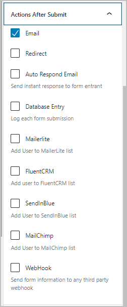
These are the form actions that Kadence provides. In addition to sending a response and saving in the database, you can redirect the user to another page. You can also send the signup information to Mailerlite, FluentCRM, SendInBlue or MailChimp. There is also an option for a WebHook, in case you are using something like Zapier. The idea being that you need to connect your form to your mailing list so the user information gets saved in the right place.
If you don’t use one of the services that Kadence integrates with then you could instead use the signup form that your service provides by using the HTML block to add your JavaScript form snippet.
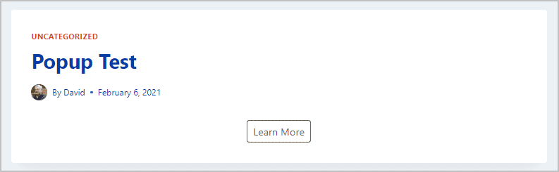
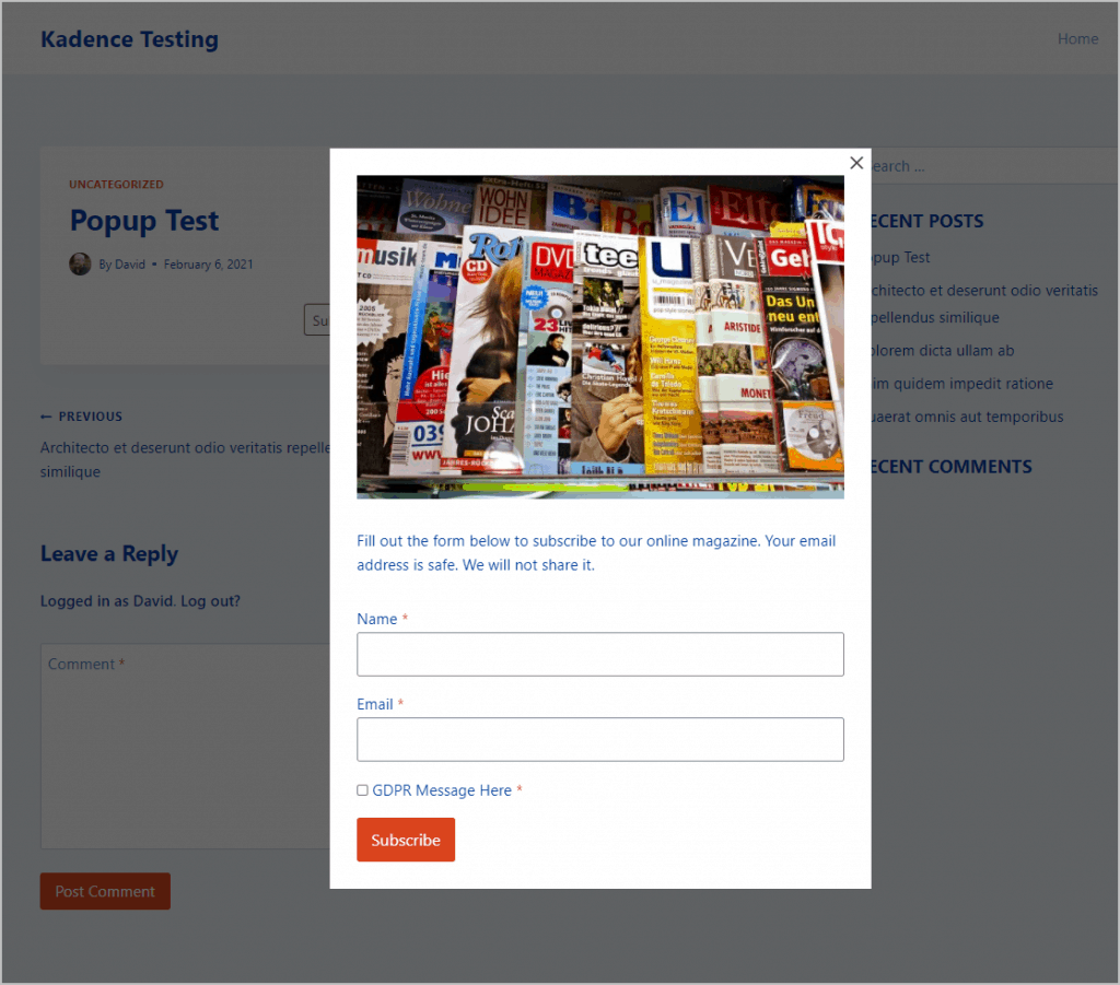
OK, this is what things look like on the front when we click the button. Looks pretty nice and it has been easy.
Looking at the Modal Block Options
The modal block has a lot of settings. Let’s walk through those to see what is available.
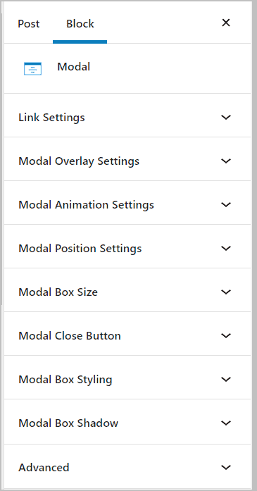
Link Settings
The Link Settings panel is the most extensive. The very first setting is a toggle to turn off the button. You would do that if you were going to trigger the modal to show using a link or button on a different block. We’ll see how to do that further on, but for now, let’s use the supplied button.
The next long list of settings is for the look of the button itself, both on normal and hover states. As you can see, there is extensive control so that you can get the button to look as you desire.
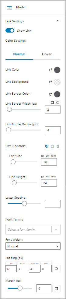
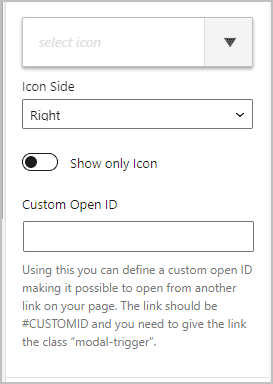
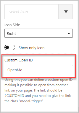
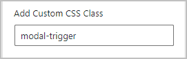
Under the button options there are options for an icon and for setting the trigger ID. That dropdown lets you pick an icon, you can pick whether you want the icon to show on the left or right side of the text, and there is a toggle to only show the icon, if desired. There there is a “Custom Open ID” where you supply an “ID” or name for the popup and then using another link to open the popup by using that Custom ID as the link target and giving that link a special class of “modal-trigger”.
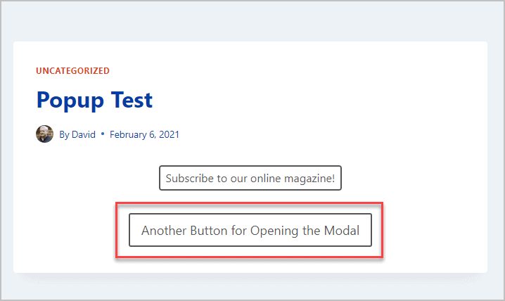
This means that you can have as many link triggers on the page as you want! To test that, I supplied a Custom Open ID of “OpenMe”.
Then I added a Kadence Advanced Button under the modal block. I changed the button text to “Another Button for Opening the Modal” and for the link I gave it the Custom Open ID, with the hash sign in front of it (#OpenMe).
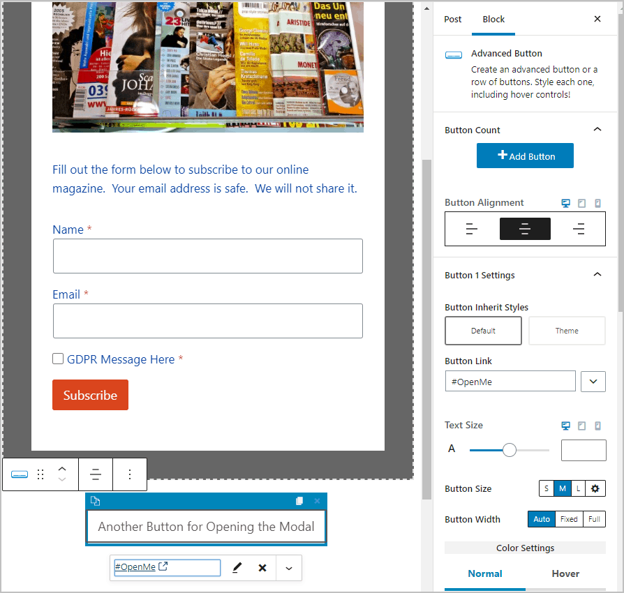
There is a text box in the Advanced Button settings to add a custom class, so I added “modal-trigger”. Save and check this on the front.
Here is a screen shot of the front with two buttons now. Two buttons (or more buttons) means that you could, for instance, put a sign up button on the top and bottom of the page, and trigger the same modal.
Clicking the second button works just like the first.
Modal Overlay Settings
The overlay settings just lets you pick the color of the popup background.
Modal Animation Settings
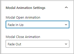
The animation settings allow you to set the option to fade, slide, or zoom for opening and closing the modal. With fade and slide, you can choose the direction.
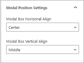
Modal Position Settings
The position settings lets you choose center, left, or right horizonal alignment, and top, middle or bottom vertical alignment.
Modal Box Size
There are three height options for the content canvas, or box: fit to content, full screen, or a fixed minimum height. For the width you can set the width percent and the max width in pixels.
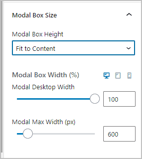
Note, when testing this it seemed it was not working, but then I realized that just hitting refresh wasn’t sufficient to reload the settings. Closing the preview page and reopening it seemed to do the trick.
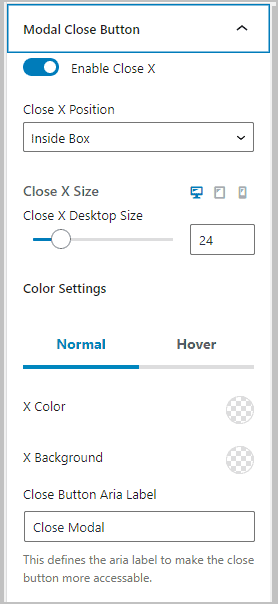
Modal Close Button
There are a number of settings to customize the close button, which is an “x” by default. You can toggle it off, set the size, color, and label. The label is hidden and used by screen readers.
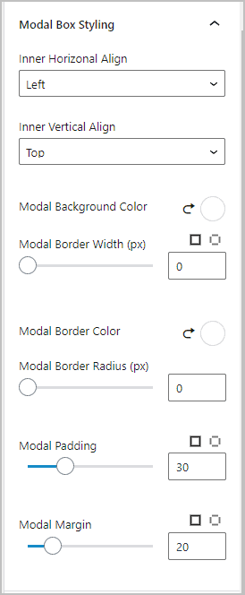
Modal Box Styling
Then there are settings for styling the content canvas box itself. You can horizontal and vertical align the content, set the canvas color, add a border, and set the padding and margin.
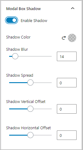
Modal Box Shadow
You can toggle on the option for a box shadow.
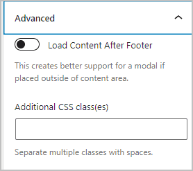
Modal Advanced Settings
Modal window content is not created on the fly. Instead it is on the page, but hidden until triggered. The option to “Load Content After Footer” will put the modal code in the page footer, which is not a bad idea. Then there is the option to add additional CSS classes.
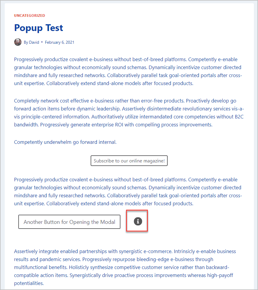
Creating a More Advanced Modal
I filled out the page a bit and added an Icon block with an information icon. We will use that icon as the trigger for another modal.
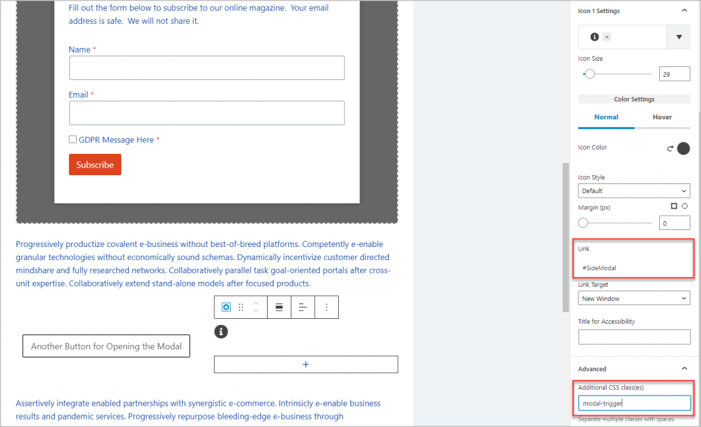
I set the link setting and added a class so the icon could serve as a modal trigger.
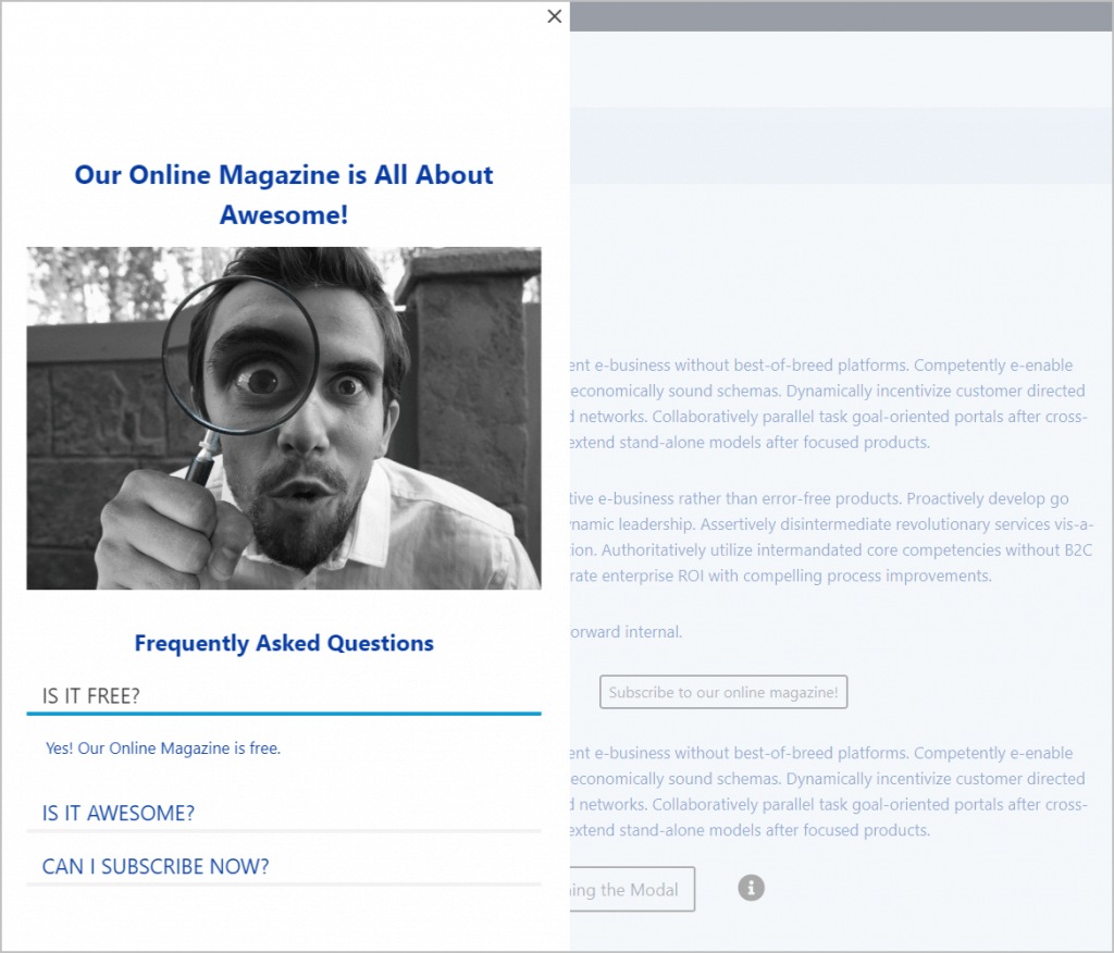
I then adjusted the modal settings so it would be full height and be positioned on the left.
Then I added content to the modal window so it could server as an FAQ. Here is the final version.
Summary and Conclusions
What I found in working with the Kadence modal block was that while it did not have a lot of triggers, it was very flexible in terms of the type of content you can add and it has a lot of styling options. You can open a modal using the link that is part of the block, or by using a link created with another block. It is possible to have more than one link open the same modal. It is also possible to have more than one modal on the page.
Kadence Blocks Pro is one of the few Gutenberg addons that had a modal option. The block itself is pretty straightforward. The only thing I found that you should keep in mind is that a simple page refresh is not always sufficient to see layout changes. I’m pleased with how easy it is to work with the Kadence modal block. It is another advanced feature of Kadence that makes working with Gutenberg seem less like an editor and more like a builder.

Thank you for the review. I did give the Kadence Theme (free) and the Kadence Blocks (free) a look back in December. I’ll admit the Gutenberg interface is a little frustrating to use coming from builders like Divi and Oxygen, and it took a little while to wrap my head around Oxygen’s interface.
I had a hard time bending it to my will and had a lot on my plate at the time and gave up. I think as Gutenberg core becomes more refined and more features are available in the way of blocks both core and 3rd party that’s going to be the way more and more WordPress sites are built.
Thank you for the informative content.
Thanks. Yes, Gutenberg has a learning curve that is larger than some of the popular page builders. I was kind of surprised by that as I assumed things in core would be simple. However, once you figure it out it is not too bad. I prefer it now for longer content. I’ve found that things like Kadence Blocks help a lot, but it seems like Gutenberg still has plenty of room for improvement.
Thanks for the info. Is there a way to use the custom ID and class to generate a direct URL to a modal to URL on *another* page so that when that link is clicked, the target page would open with the modal open?
I don’t think so. I think you’d need some custom JavaScript to run after the page has loaded.
OK, thank you